Back

Designing for Readiness: How a Secondary CTA Increased Commitment

A portrait of you.

Context:

A little paragraph introduction that gives a sense of what you do, who you are, where you’re from, and why you created this website. This is the most likely part of the page to be read in full.

A little paragraph introduction that gives a sense of what you do, who you are, where you’re from, and why you created this website. This is the most likely part of the page to be read in full.

A little paragraph introduction that gives a sense of what you do, who you are, where you’re from, and why you created this website. This is the most likely part of the page to be read in full.

Hypothesis

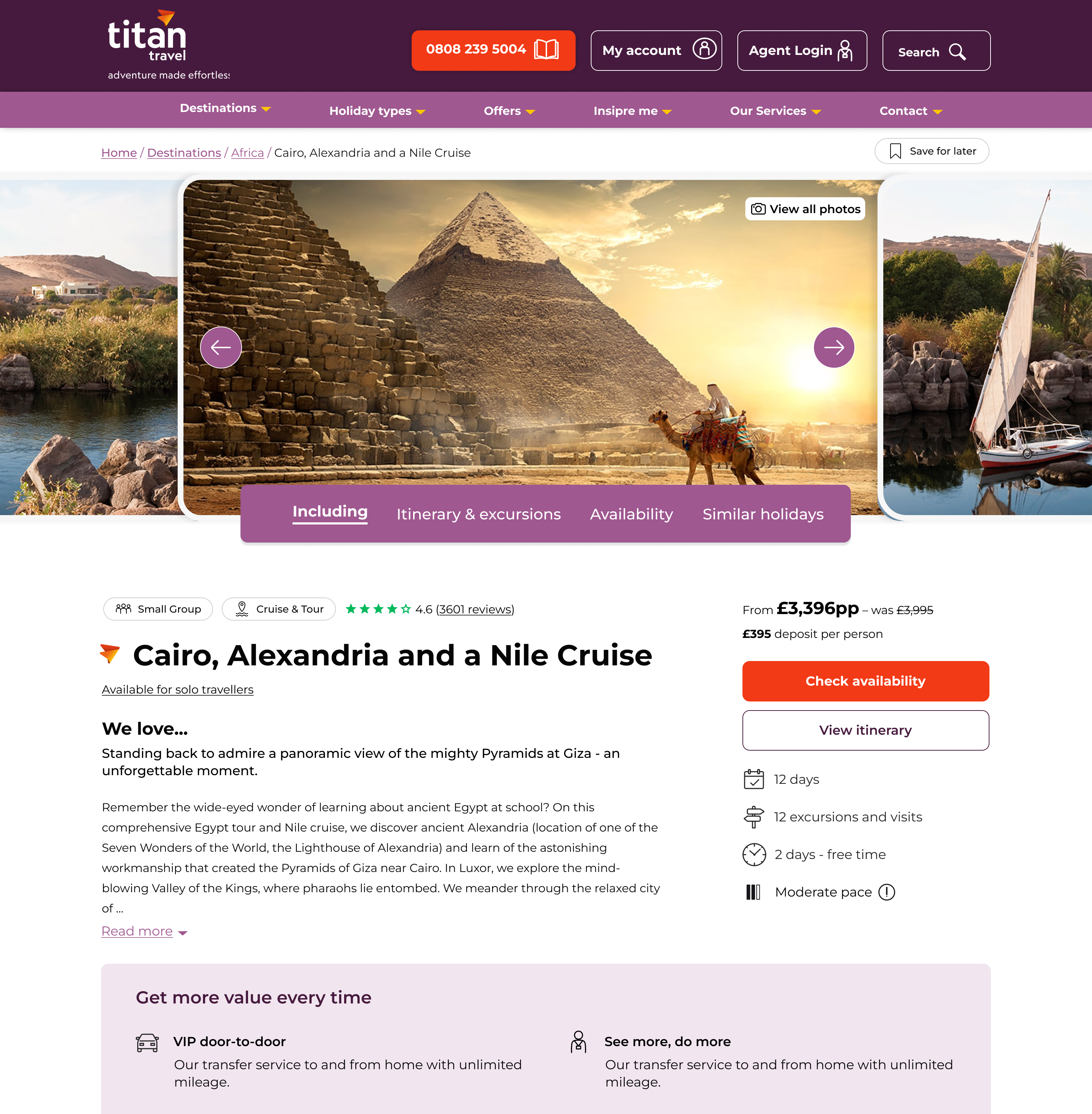
By introducing a secondary, lower commitment CTA (“View Itinerary”) beneath “Check Availability,” we will increase engagement with decision-critical content, improve user readiness, and strengthen progression to the primary action.

Concept

Rather than pushing all users toward immediate commitment, the design supports different intent states:

High-intent users: “Check Availability”

Mid-intent users: “View Itinerary”

Grounded in progressive commitment principles, the secondary CTA reduces psychological friction and increases decision confidence before commitment.

Experiment Setup

Traffic Split: 50/50

Audience: All PDP visitors

Duration: 24th Feb 2025 - 14th Apr 2025

Device Coverage: Desktop & Mobile

Test Type: A/B experiment

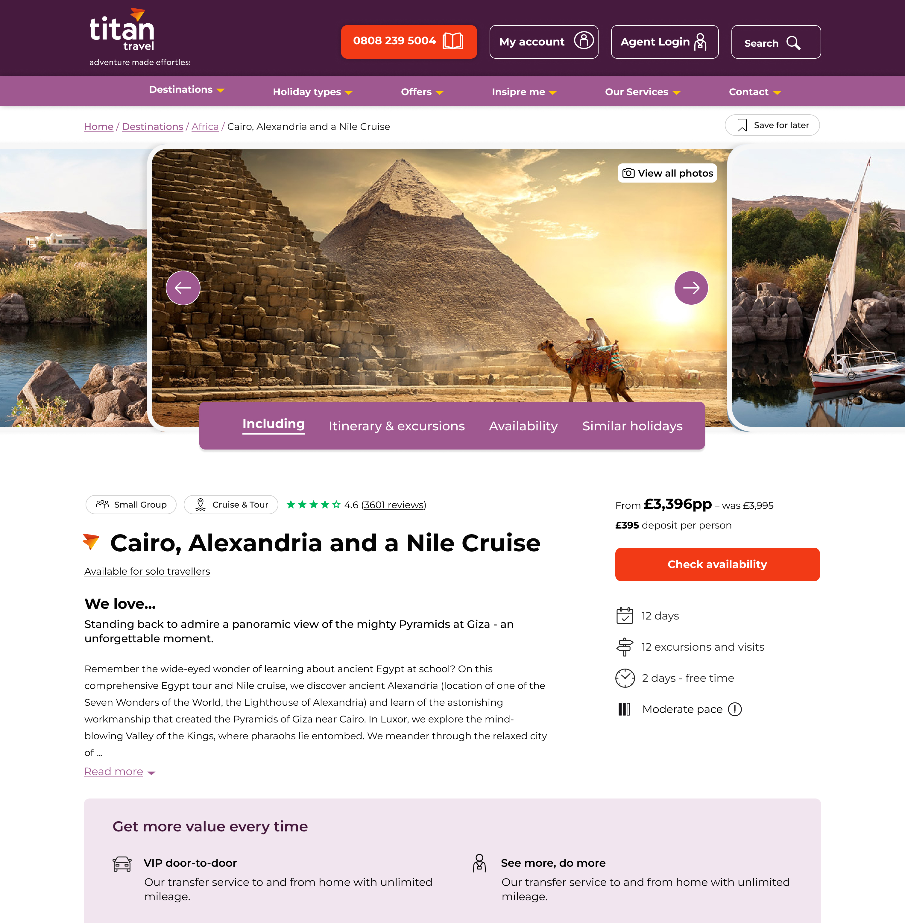
V0 Control

  • Single primary CTA: “Check Availability”
  • Itinerary accessible via scroll only

V1 Variant

  • Primary CTA: “Check Availability”
  • Secondary CTA added beneath: “View Itinerary”
  • Anchored scroll to itinerary section
  • Clear visual hierarchy to protect primary CTA prominence

Measures of Success

Primary Metric:

  • Revenue per visitor
  • Total revenue uplift

Secondary Metrics:

  • Click-through rate (CTR) on “Check Availability”
  • Engagement with itinerary section
  • Scroll depth
  • Progression to availability section

Expected Behavioural Flow

  1. User lands on PDP
  2. Not fully ready to check availability
  3. Clicks “View Itinerary”
  4. Gains confidence and clarity
  5. Returns to primary CTA
  6. Clicks “Check Availability”

Results & Outcome

The experiment did not reach statistical significance.

While the progressive fields variant showed a slight increase in orders (+1.1%), it underperformed against the control on key business metrics:

The secondary CTA successfully supported mid-intent users without diluting commitment intent, ultimately strengthening commercial performance.

  • “Check Availability” CTR increased from 18% to 21%
  • Booking conversion rate improved from 1.2% to 1.46%
  • Revenue increased from £360K to £438K over the test period

Careful visual hierarchy ensured the secondary CTA supported, rather than competed with, the primary conversion intent.

Back

Designing for Readiness: How a Secondary CTA Increased Commitment
A portrait of you.

Context:

A little paragraph introduction that gives a sense of what you do, who you are, where you’re from, and why you created this website. This is the most likely part of the page to be read in full.

A little paragraph introduction that gives a sense of what you do, who you are, where you’re from, and why you created this website. This is the most likely part of the page to be read in full.

A little paragraph introduction that gives a sense of what you do, who you are, where you’re from, and why you created this website. This is the most likely part of the page to be read in full.

Hypothesis

By introducing a secondary, lower commitment CTA (“View Itinerary”) beneath “Check Availability,” we will increase engagement with decision-critical content, improve user readiness, and strengthen progression to the primary action.

Concept

Rather than pushing all users toward immediate commitment, the design supports different intent states:

High-intent users: “Check Availability”

Mid-intent users: “View Itinerary”

Grounded in progressive commitment principles, the secondary CTA reduces psychological friction and increases decision confidence before commitment.

Experiment Setup

Traffic Split: 50/50

Audience: All PDP visitors

Duration: 24th Feb 2025 - 14th Apr 2025

Device Coverage: Desktop & Mobile

Test Type: A/B experiment

V0 Control

  • Single primary CTA: “Check Availability”
  • Itinerary accessible via scroll only

V1 Variant

  • Primary CTA: “Check Availability”
  • Secondary CTA added beneath: “View Itinerary”
  • Anchored scroll to itinerary section
  • Clear visual hierarchy to protect primary CTA prominence
Measures of Success

Primary Metric:

  • Revenue per visitor
  • Total revenue uplift

Secondary Metrics:

  • Click-through rate (CTR) on “Check Availability”
  • Engagement with itinerary section
  • Scroll depth
  • Progression to availability section

Expected Behavioural Flow

  1. User lands on PDP
  2. Not fully ready to check availability
  3. Clicks “View Itinerary”
  4. Gains confidence and clarity
  5. Returns to primary CTA
  6. Clicks “Check Availability”

Results & Outcome

The experiment did not reach statistical significance.

While the progressive fields variant showed a slight increase in orders (+1.1%), it underperformed against the control on key business metrics:

The secondary CTA successfully supported mid-intent users without diluting commitment intent, ultimately strengthening commercial performance.

  • “Check Availability” CTR increased from 18% to 21%
  • Booking conversion rate improved from 1.2% to 1.46%
  • Revenue increased from £360K to £438K over the test period

Careful visual hierarchy ensured the secondary CTA supported, rather than competed with, the primary conversion intent.
Back

Designing for Readiness: How a Secondary CTA Increased Commitment

A portrait of you.

Context:

The Product Detail Page (PDP) featured a single primary CTA: “Check Availability.”

For high-consideration tours, users often require deeper validation, particularly itinerary review, before committing to availability checks. While itinerary content was available on the page, it required scrolling and effort to access, especially on mobile.

This created friction for mid-intent users who were still evaluating the trip.

Hypothesis

By introducing a secondary, lower commitment CTA (“View Itinerary”) beneath “Check Availability,” we will increase engagement with decision-critical content, improve user readiness, and strengthen progression to the primary action.

Concept

Rather than pushing all users toward immediate commitment, the design supports different intent states:

High-intent users: “Check Availability”

Mid-intent users: “View Itinerary”

Grounded in progressive commitment principles, the secondary CTA reduces psychological friction and increases decision confidence before commitment.

Experiment Setup

Traffic Split: 50/50

Audience: All PDP visitors

Duration: 24th Feb 2025 - 14th Apr 2025

Device Coverage: Desktop & Mobile

Test Type: A/B experiment

V0 Control

  • Single primary CTA: “Check Availability”
  • Itinerary accessible via scroll only

V1 Variant

  • Primary CTA: “Check Availability”
  • Secondary CTA added beneath: “View Itinerary”
  • Anchored scroll to itinerary section
  • Clear visual hierarchy to protect primary CTA prominence

Measures of Success

Primary Metric:

  • Revenue per visitor
  • Total revenue uplift

Secondary Metrics:

  • Click-through rate (CTR) on “Check Availability”
  • Engagement with itinerary section
  • Scroll depth
  • Progression to availability section

Expected Behavioural Flow

  1. User lands on PDP
  2. Not fully ready to check availability
  3. Clicks “View Itinerary”
  4. Gains confidence and clarity
  5. Returns to primary CTA
  6. Clicks “Check Availability”

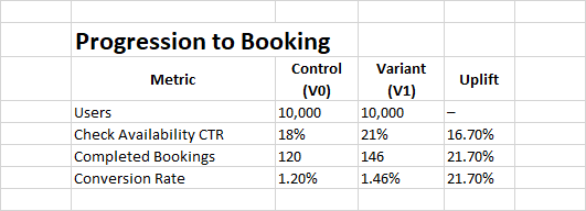
Results & Outcome

The variant delivered a 22% revenue uplift, driven by increased progression to the primary CTA and higher booking conversion.

  • “Check Availability” CTR increased from 18% to 21%
  • Booking conversion rate improved from 1.2% to 1.46%
  • Revenue increased from £360K to £438K over the test period

The secondary CTA successfully supported mid-intent users without diluting commitment intent, ultimately strengthening commercial performance.

Careful visual hierarchy ensured the secondary CTA supported, rather than competed with, the primary conversion intent.