
Back
Rebuilding Saga's Design System for Scale and Brand Evolution
Audited, redesigned and scaled a multi-product design system to accelerate delivery, improve consistency, and support a company-wide brand transformation.
3x
Component reuse
30%
Faster implementation
85%
Component reuse
My role: Senior Designer
Timeline: Q1 2022
Audit

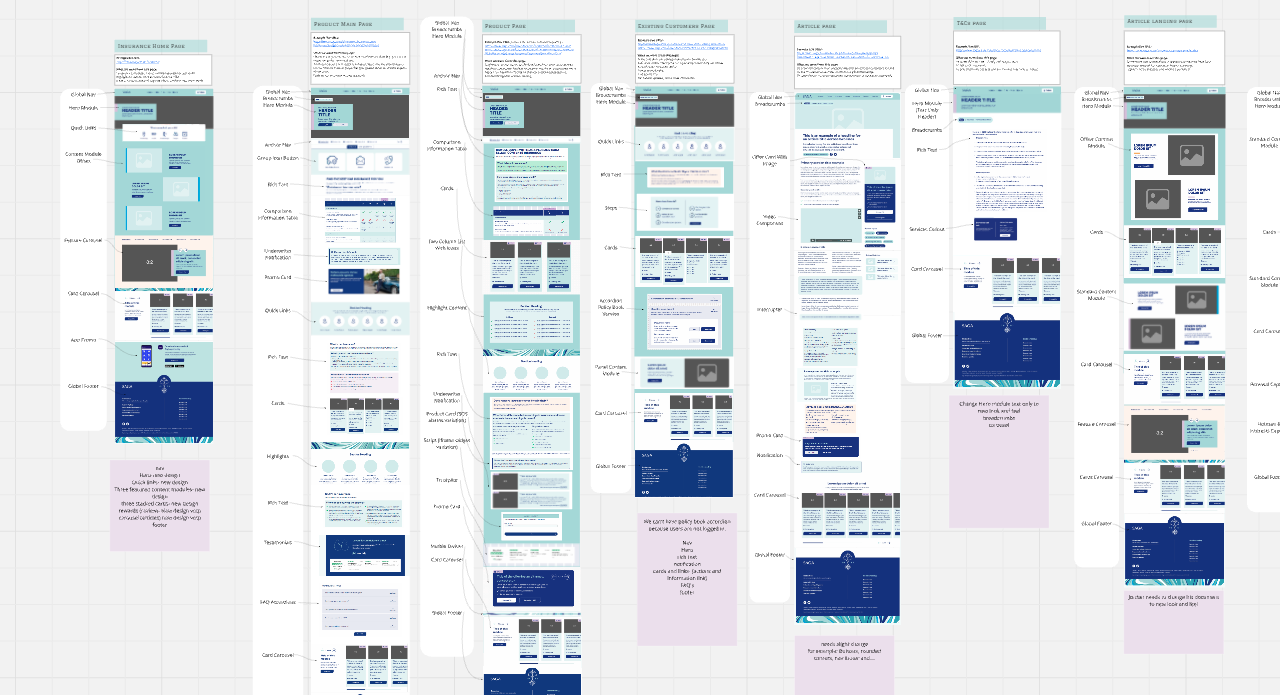
Before introducing new components or patterns, I conducted a comprehensive audit of the existing system to understand its strengths, gaps, and opportunities.
The audit examined:
Component usage and duplication
Visual consistency across products
Accessibility compliance
Design-to-development workflows
Documentation quality and discoverability
Adoption across teams
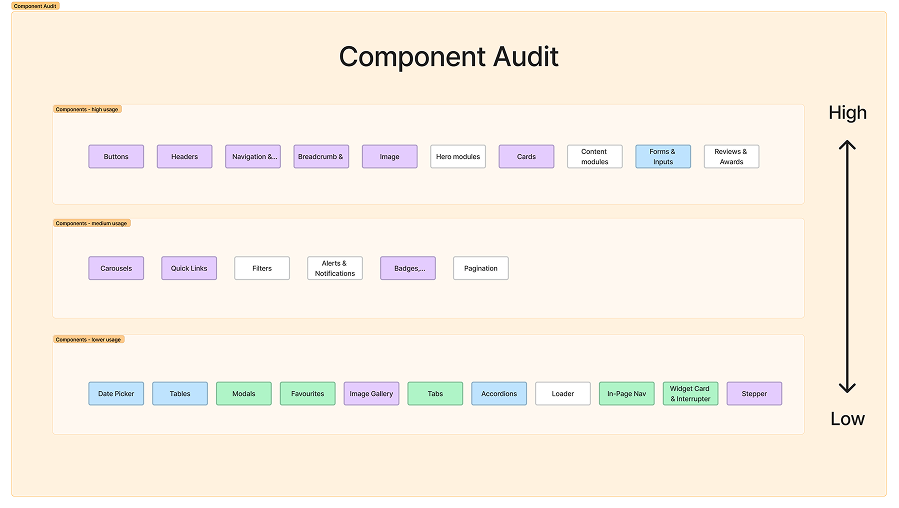
Used click-rate and tracking data to identify high-performing components, retaining them with minor visual or accessibility updates
Key Findings
Design and engineering teams were solving the same problems repeatedly
Documentation lacked consistency and ownership
Brand updates required significant manual effort
Inconsistance naming conventions
Multiple variations of similar components existed across products
Adoption varied considerably between teams
Design Principles
Designing for Clarity and Inclusion
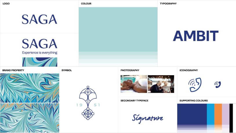
With many Saga customers being older adults, accessibility became a guiding principle throughout the system. Decisions around typography, colour, spacing, interaction patterns, and content hierarchy were made to improve readability, usability, and confidence for a diverse range of users.
The redesign was guided by four core principles:
Consistency
Create a unified language that could be applied across products while reducing unnecessary variation.
Scalability
Build foundations that could support future products, features, and brand evolution.
Accessibility
Ensure accessibility considerations were embedded into components and patterns from the start.
Efficiency
Reduce duplication and enable teams to move faster through reusable, well-documented solutions.
Timeline & planning
Collaborated with the product owner to estimate the effort required across design, development, and testing. Allocated one month for the design phase based on scope and resource availability
Split the work into two categories:
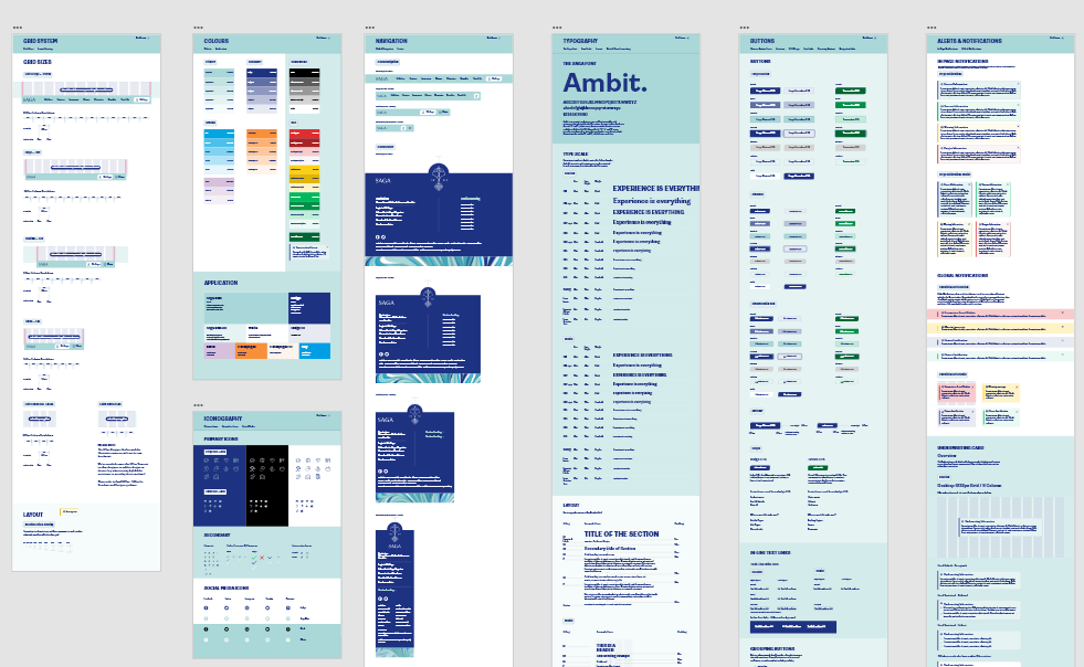
Foundation: typography, spacing, grids, Iconography, accessibility guidelines
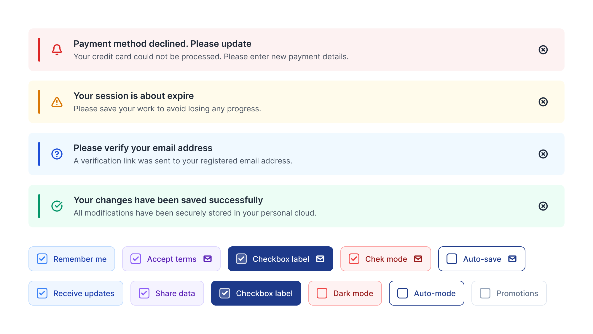
Core Components: buttons, cards, forms, navigation, banners, modals, product cards, etc.
Broke the Epic into 40 tickets to support structured delivery and effective collaboration
Prioritised foundational elements first to support scalable and consistent rollout.
Implementation

I adopted a Design Token approach for the implementation to easily can expanded in future and minimizing developers work.
Accessibility was built into the foundation of the design system from the start. Following WCAG 2.1 AA guidelines, I created a checklist to cover key areas such as heading structure, colour contrast, keyboard navigation, and touch-friendly components. The system was designed to support future AAA-level enhancements.
Two sprint:
Week 1
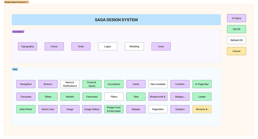
- Defined the overall structure of the design system
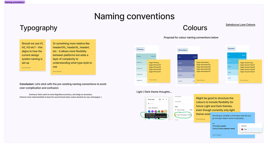
- Established naming conventions (e.g. for typography and primary/secondary colours)
- Audited existing components from the old design system
Week 2
- Set up the foundational component library in Figma
- Validated the component structure using an object-oriented approach to ensure flexibility and reusability across use cases
Week 3
- Built out components in the core library, starting with high-use elements and progressing to medium and lower-use components
Week 4
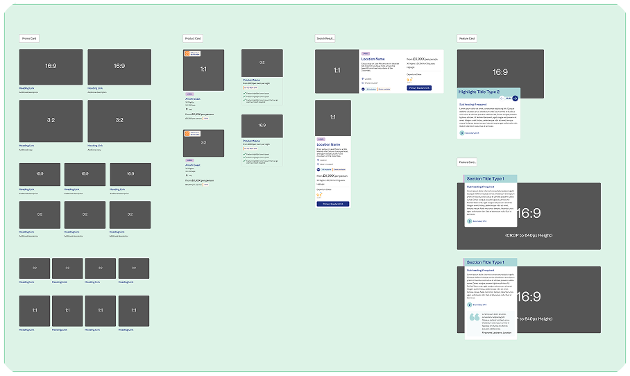
- Continued building remaining components in the core library
- Used the components to create a set of example templates for validation and demonstration
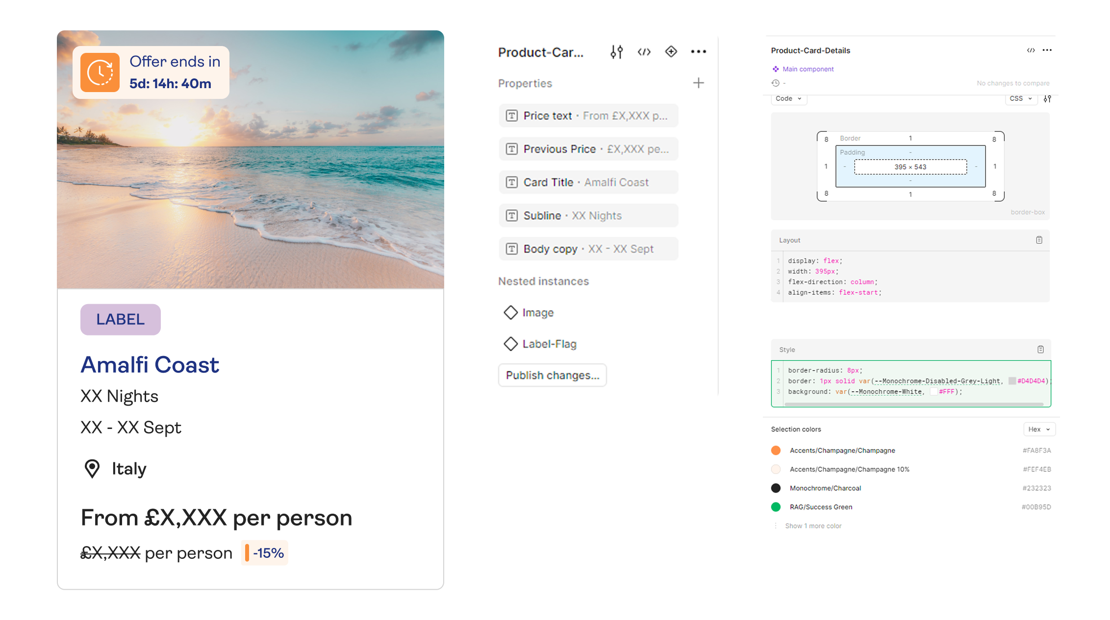
Foundations & Components
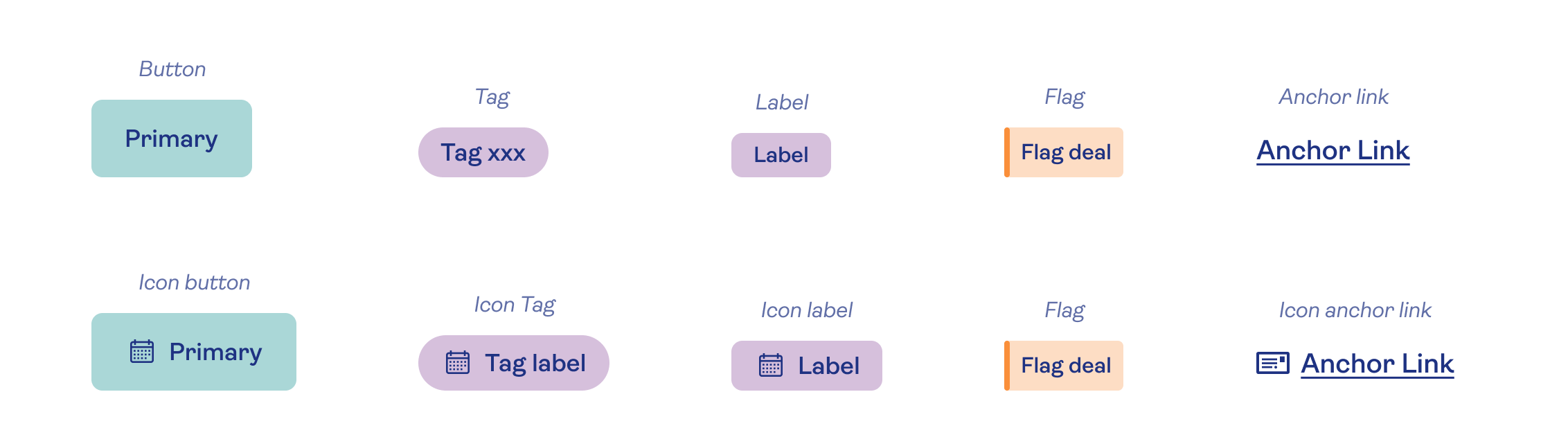
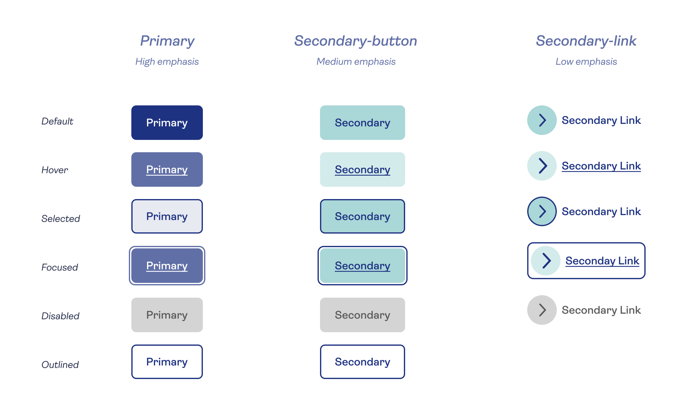
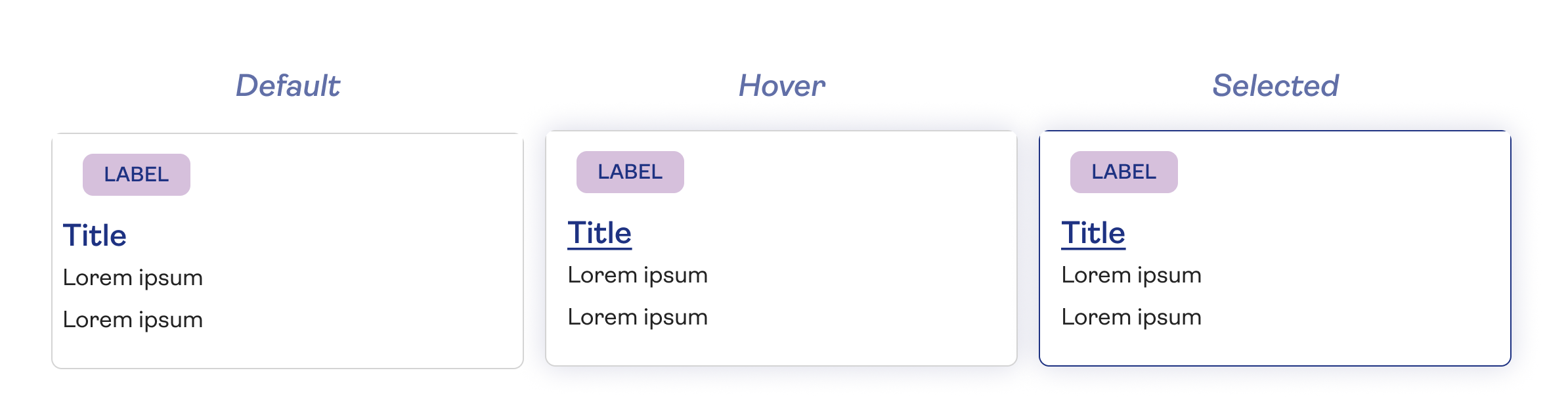
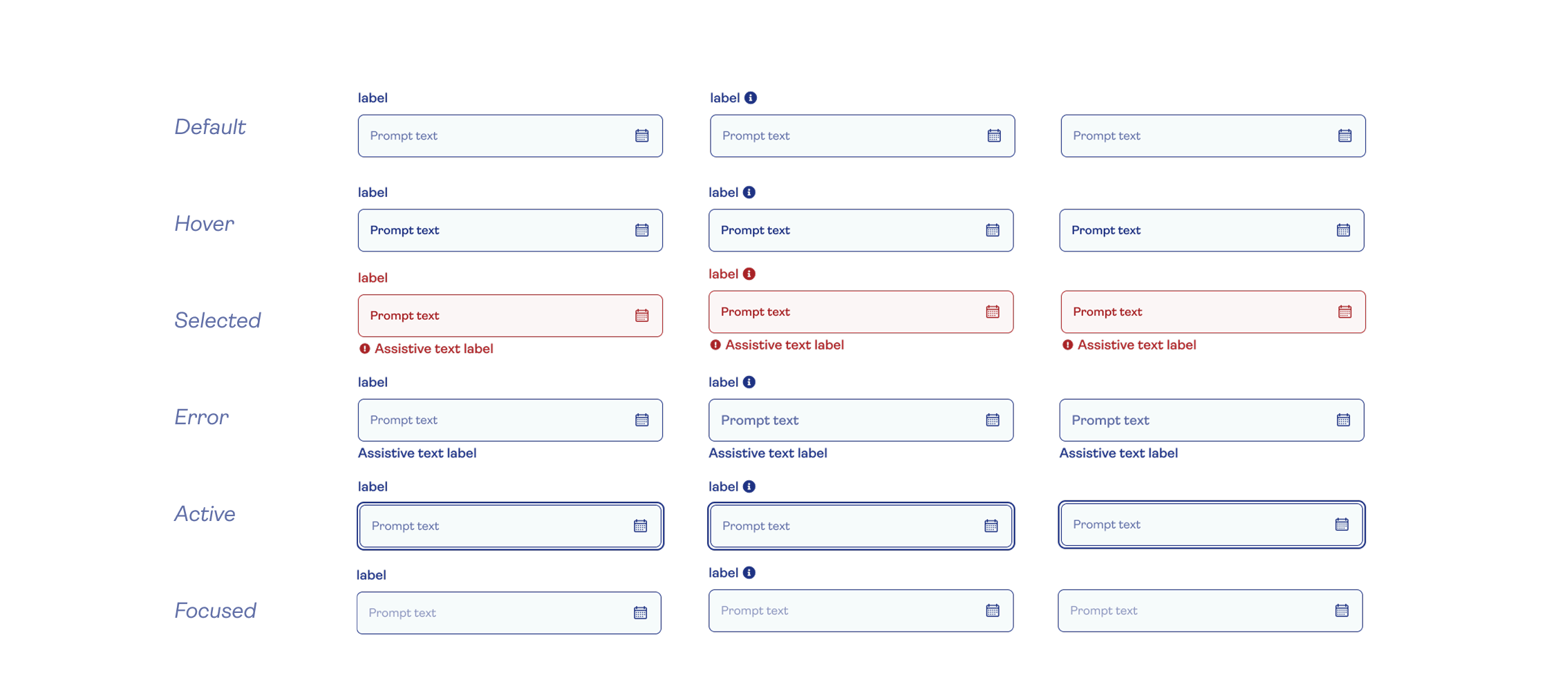
To improve scalability, consistency, and accessibility, the system's foundations and component library were redesigned as a single ecosystem.
Key improvements included:
- Design tokens
- Responsive foundations
- Accessibility-first standards
- Clear naming conventions
- Consolidated components
- Flexible variants
- Consistent interactions
- Better documentation

Validation
Each component was tested for visual consistency, accessibility, and real-world usability. I applied the system in example templates and gathered feedback from developers and product teams to ensure it was flexible, accessible, and easy to implement.
Documentation
Documentation was restructured to provide clear guidance on usage, accessibility considerations, and implementation best practices. This helped establish a shared understanding between designers and engineers and encouraged consistent adoption.
Back
Rebuilding Saga's Design System for Scale and Brand Evolution
Audited, redesigned and scaled a multi-product design system to accelerate delivery, improve consistency, and support a company-wide brand transformation.
3x
Component reuse
30%
Faster implementation
85%
Adoption across digital products
My role: Senior Designer
Timeline: Q1 2022
Audit
Before introducing new components or patterns, I conducted a comprehensive audit of the existing system to understand its strengths, gaps, and opportunities.
The audit examined:
Component usage and duplication
Visual consistency across products
Accessibility compliance
Design-to-development workflows
Documentation quality and discoverability
Adoption across teams
Used click-rate and tracking data to identify high-performing components, retaining them with minor visual or accessibility updates
Key Findings
Design and engineering teams were solving the same problems repeatedly
Documentation lacked consistency and ownership
Brand updates required significant manual effort
Inconsistance naming conventions
Multiple variations of similar components existed across products
Adoption varied considerably between teams
Design Principles
Designing for Clarity and Inclusion
With many Saga customers being older adults, accessibility became a guiding principle throughout the system. Decisions around typography, colour, spacing, interaction patterns, and content hierarchy were made to improve readability, usability, and confidence for a diverse range of users.
The redesign was guided by four core principles:
Consistency
Create a unified language that could be applied across products while reducing unnecessary variation.
Scalability
Build foundations that could support future products, features, and brand evolution.
Accessibility
Ensure accessibility considerations were embedded into components and patterns from the start.
Efficiency
Reduce duplication and enable teams to move faster through reusable, well-documented solutions.
Timeline & planning
Collaborated with the product owner to estimate the effort required across design, development, and testing. Allocated one month for the design phase based on scope and resource availability
Split the work into two categories:
Foundation: typography, spacing, grids, Iconography, accessibility guidelines
Core Components: buttons, cards, forms, navigation, banners, modals, product cards, etc.
Broke the Epic into 40 tickets to support structured delivery and effective collaboration
Prioritised foundational elements first to support scalable and consistent rollout.
Implementation
I adopted a Design Token approach for the implementation to easily can expanded in future and minimizing developers work.
Accessibility was built into the foundation of the design system from the start. Following WCAG 2.1 AA guidelines, I created a checklist to cover key areas such as heading structure, colour contrast, keyboard navigation, and touch-friendly components. The system was designed to support future AAA-level enhancements.
Two sprint:
Week 1
- Defined the overall structure of the design system
- Established naming conventions (e.g. for typography and primary/secondary colours)
- Audited existing components from the old design system
Week 2
- Set up the foundational component library in Figma
- Validated the component structure using an object-oriented approach to ensure flexibility and reusability across use cases
Week 3
- Built out components in the core library, starting with high-use elements and progressing to medium and lower-use components
Week 4
- Continued building remaining components in the core library
- Used the components to create a set of example templates for validation and demonstration
Foundations & Components
To improve scalability, consistency, and accessibility, the system's foundations and component library were redesigned as a single ecosystem.
Key improvements included:
- Design tokens
- Responsive foundations
- Accessibility-first standards
- Clear naming conventions
- Consolidated components
- Flexible variants
- Consistent interactions
- Better documentation
Validation
Each component was tested for visual consistency, accessibility, and real-world usability. I applied the system in example templates and gathered feedback from developers and product teams to ensure it was flexible, accessible, and easy to implement.
Documentation
Documentation was restructured to provide clear guidance on usage, accessibility considerations, and implementation best practices. This helped establish a shared understanding between designers and engineers and encouraged consistent adoption.
Rebuilding Saga's Design System for Scale and Brand Evolution
Audited, redesigned and scaled a multi-product design system to accelerate delivery, improve consistency, and support a company-wide brand transformation.
3×
Component reuse
30%
Component reuse
85%
Adoption across digital products
My role: Senior Designer
Timeline: Q1 2022
Audit
Before introducing new components or patterns, I conducted a comprehensive audit of the existing system to understand its strengths, gaps, and opportunities.
The audit examined:
Component usage and duplication
Visual consistency across products
Accessibility compliance
Design-to-development workflows
Documentation quality and discoverability
Adoption across teams
Used click-rate and tracking data to identify high-performing components, retaining them with minor visual or accessibility updates
Key Findings
Multiple variations of similar components existed across products
Design and engineering teams were solving the same problems repeatedly
Documentation lacked consistency and ownership
Inconsistence naming conventions across developers, content editors and designers
Brand updates required significant manual effort
Adoption varied considerably between teams
Design Principles
Designing for Clarity and Inclusion
With many Saga customers being older adults, accessibility became a guiding principle throughout the system. Decisions around typography, colour, spacing, interaction patterns, and content hierarchy were made to improve readability, usability, and confidence for a diverse range of users.
The redesign was guided by four core principles:
Consistency
Create a unified language that could be applied across products while reducing unnecessary variation.
Scalability
Build foundations that could support future products, features, and brand evolution.
Accessibility
Ensure accessibility considerations were embedded into components and patterns from the start.
Efficiency
Reduce duplication and enable teams to move faster through reusable, well-documented solutions.
Timeline & planning
Collaborated with the product owner to estimate the effort required across design, development, and testing. Allocated one month for the design phase based on scope and resource availability
Split the work into two categories:
Foundation: typography, spacing, grids, Iconography, accessibility guidelines
Core Components: buttons, cards, forms, navigation, banners, modals, product cards, etc.
Broke the Epic into 40 tickets to support structured delivery and effective collaboration
Prioritised foundational elements first to support scalable and consistent rollout.
Implementation
Method:
I adopted a Design Token approach for the implementation to easily can expanded in future and minimizing developers work.
Accessibility:
Accessibility was built into the foundation of the design system from the start. Following WCAG 2.1 AA guidelines, I created a checklist to cover key areas such as heading structure, colour contrast, keyboard navigation, and touch-friendly components. The system was designed to support future AAA-level enhancements.
Two sprint:
Week 1
- Defined the overall structure of the design system
- Established naming conventions (e.g. for typography and primary/secondary colours)
- Audited existing components from the old design system
Week 2
- Set up the foundational component library in Figma
- Validated the component structure using an object-oriented approach to ensure flexibility and reusability across use cases
Week 3
- Built out components in the core library, starting with high-use elements and progressing to medium and lower-use components
Week 4
- Continued building remaining components in the core library
- Used the components to create a set of example templates for validation and demonstration
Foundations & Components
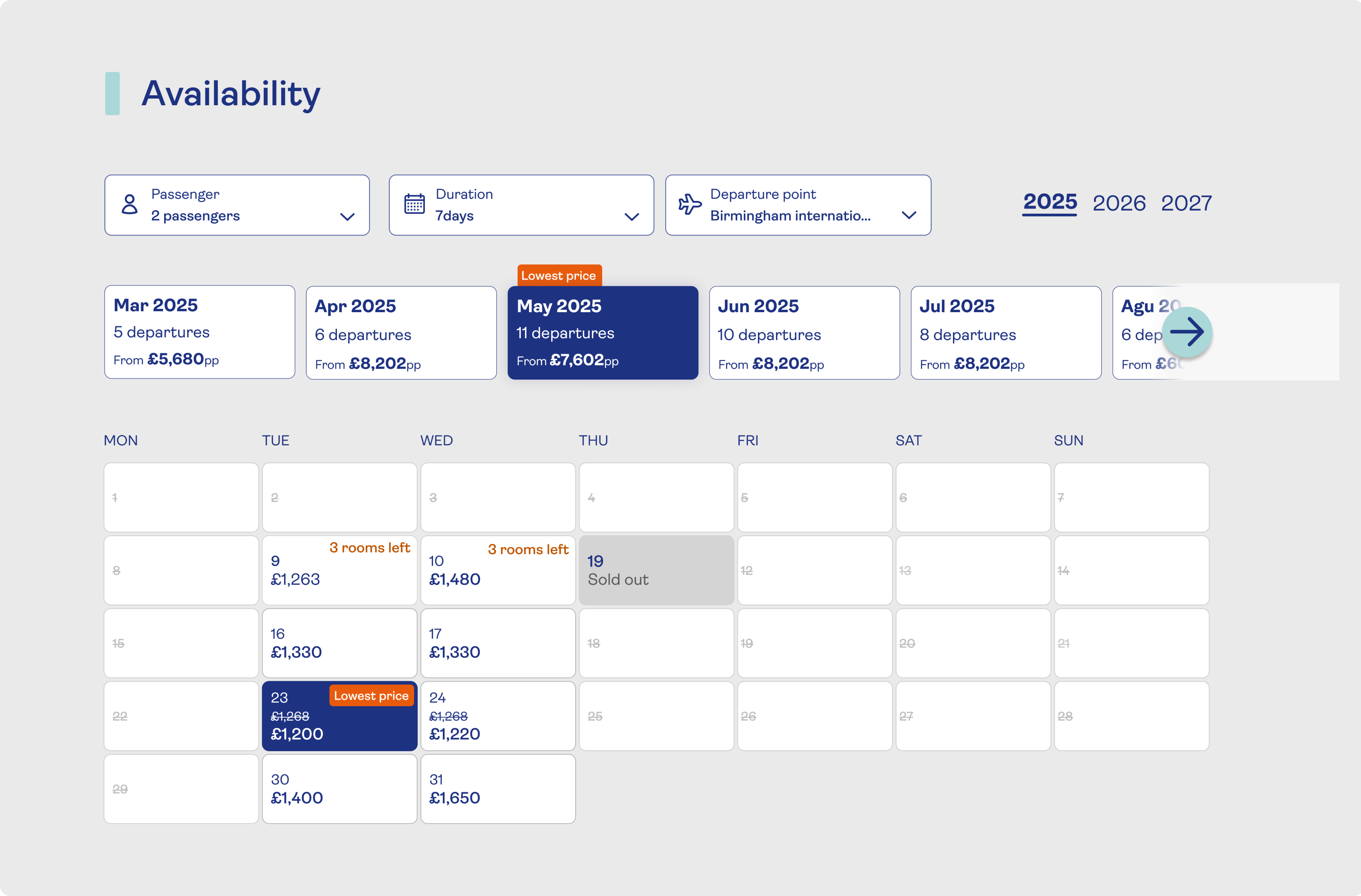
To improve scalability, consistency, and accessibility, the system's foundations and component library were redesigned as a single ecosystem.
Key improvements included:
- Design tokens
- Responsive foundations
- Accessibility-first standards
- Clear naming conventions
- Consolidated components
- Flexible variants
- Consistent interactions
- Better documentation
Validation
Each component was tested for visual consistency, accessibility, and real-world usability. I applied the system in example templates and gathered feedback from developers and product teams to ensure it was flexible, accessible, and easy to implement.
Documentation
Documentation was restructured to provide clear guidance on usage, accessibility considerations, and implementation best practices. This helped establish a shared understanding between designers and engineers and encouraged consistent adoption.