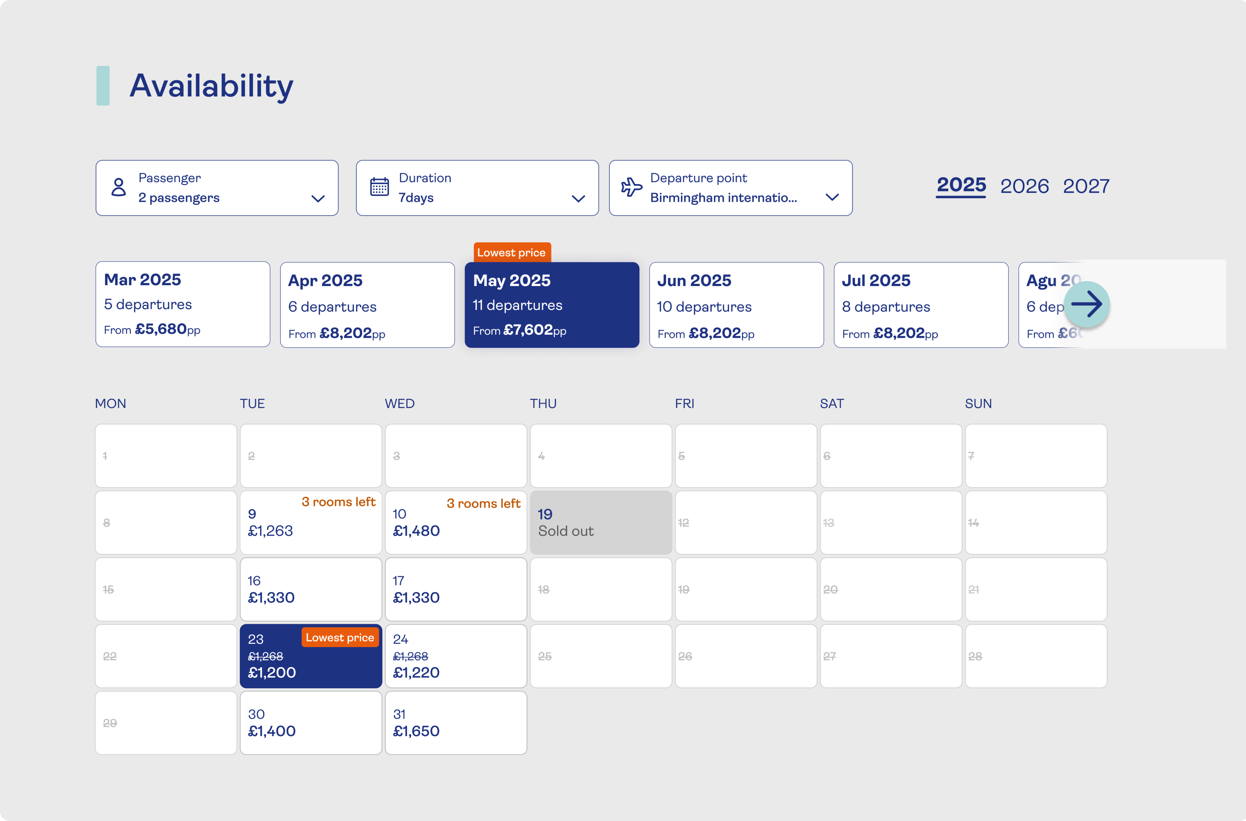
Back
Holiday Search Redesign
Redesigning holiday search around destination-first intent
Saga Holidays serves a wide range of products, including tours, cruises, rail journeys, hotel stays, and special-interest holidays. The search experience asked users to choose complex categories before seeing results, creating friction at the point of highest intent.
My role
Lead UX/UI
Timeline
Q1 2024
Scope
Destination-led holiday discovery
+11 pp
Search usage increased from 24% to 35%
-3 pp
Zero-result searches dropped from 7% to 4%
Context
Helping customers find the right holiday
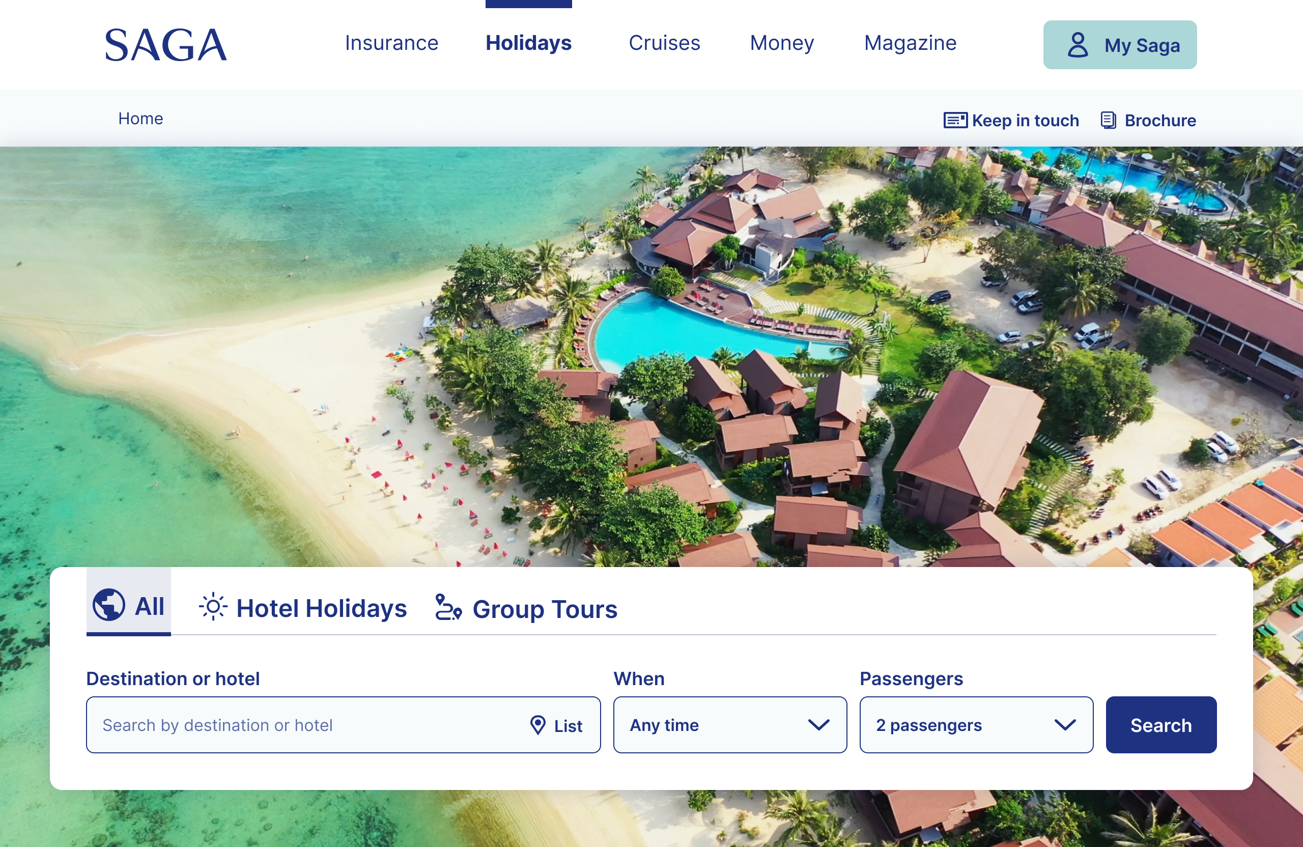
Saga Holidays offers tours, cruises, rail journeys, hotel stays and special-interest holidays. This project focused on how customers begin a search and reach relevant results. The search experience brought together:
Destination
Travel dates and duration
Number of passengers
Holiday type
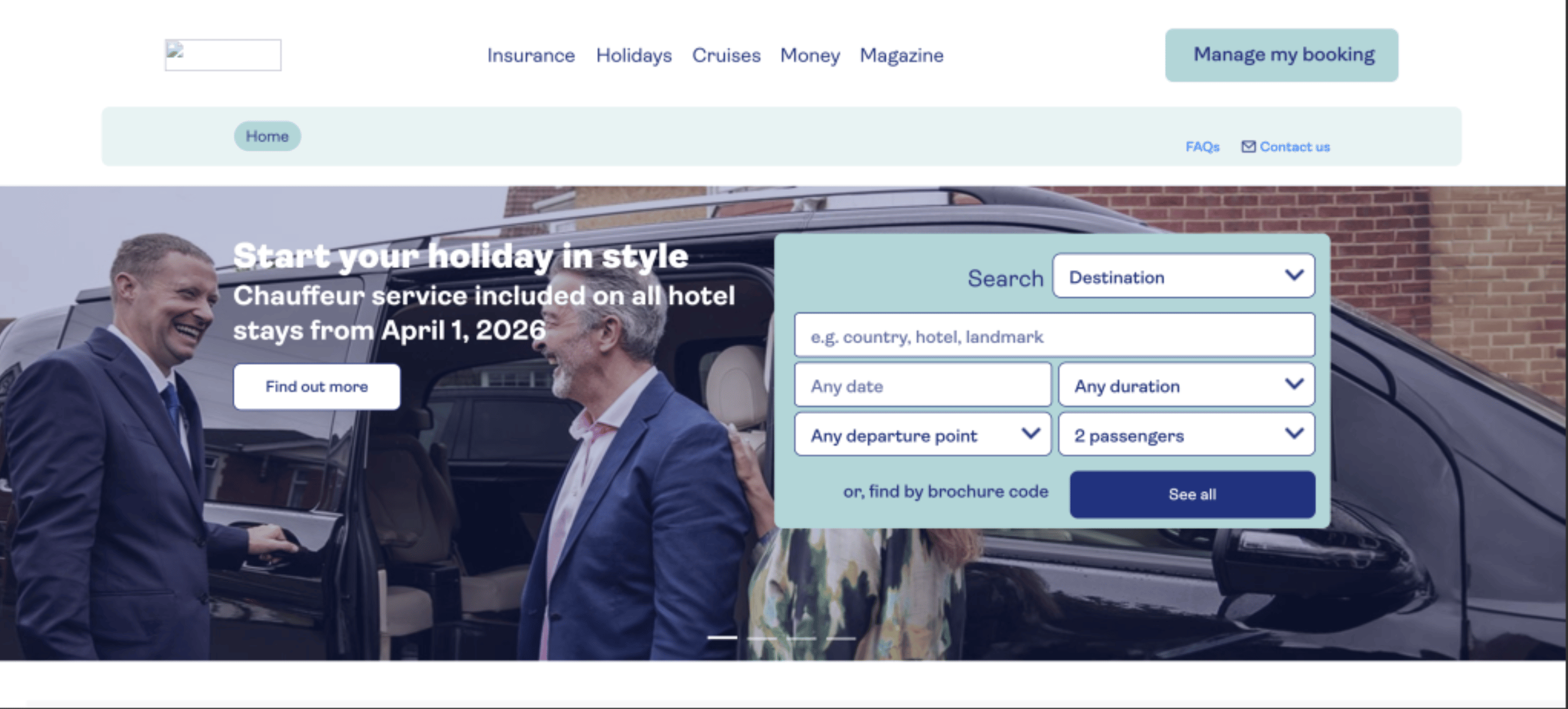
The existing entry point placed detailed categories before discovery. The goal was to help customers explore relevant holidays first and refine their choices afterwards.
Problem & evidence
Too many choices before relevant results
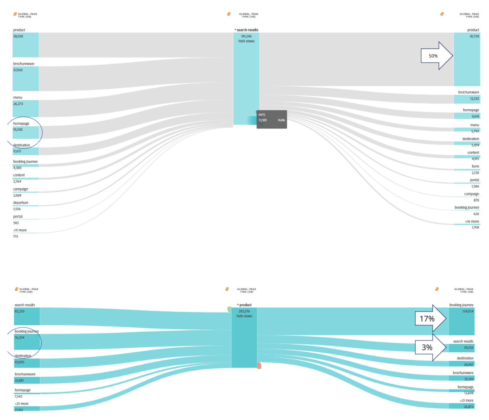
Data showed a significant gap between the number of users visiting Saga Holiday pages with the search bar and the number who reached search results.
- The original diagnostic snapshot recorded 1,094,560 holiday-homepage visits and 260,480 search links triggered, corresponding to approximately 24% search usage. This highlighted the need to understand where customers encountered friction.
A successful search was defined as a user reaching a results page without abandoning the journey, returning to the main navigation, or encountering a zero-result outcome.
Search Bar Behaviour
How users actually interacted with the search bar
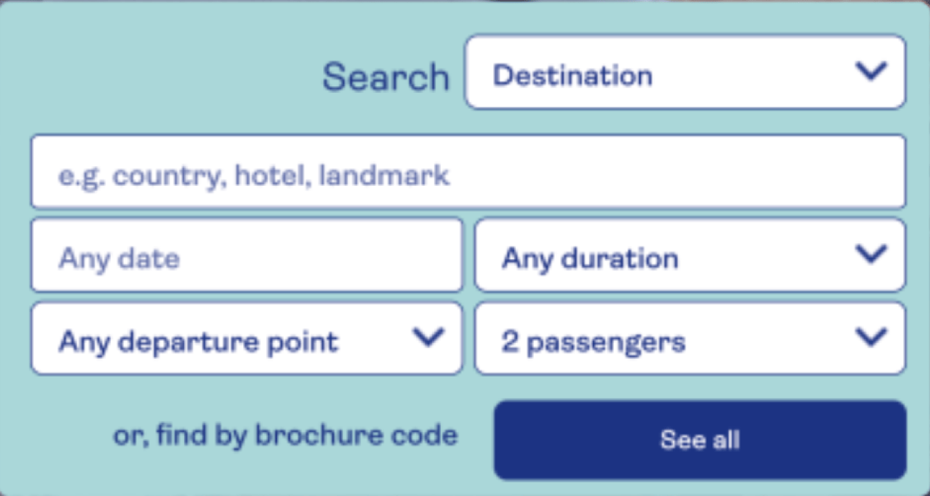
Interaction data showed that users rarely started their journey by selecting a holiday type. Engagement was heavily skewed toward destination-led search.
- 42% started with Destination
- 15% used Time & Duration
- 6% adjusted Number of Passengers
- Only 3% selected a Holiday Type
Most users kept Destination as the default option in the first dropdown, indicating that categorisation was not a natural starting point. This revealed clear early-stage friction and cognitive load at the very first interaction with the search bar.
Stakeholder alignment
Balancing commercial categories with customer intent
- I brought stakeholders together to question a key assumption: should customers choose a holiday type before seeing results?
- Categories reflected Saga’s commercial structure.
- Holiday types showcased the product range.
- The journey assumed customers already knew their preferred type.
Success meant clearer choices and stronger progression to results.
- Increase progression to results
- Reduce zero-result searches
- Simplify early decisions
- Validate category labels
Research Approach
Understanding why customers struggled to reach relevant results
I combined moderated usability testing, card sorting and SEO review to investigate why customers struggled to reach relevant results.
- Moderated usability testing on Saga and competitors with existing and potential customers
- Card sorting to validate whether holiday type labels made sense
- SEO review to understand the real terms users search for when planning a holiday
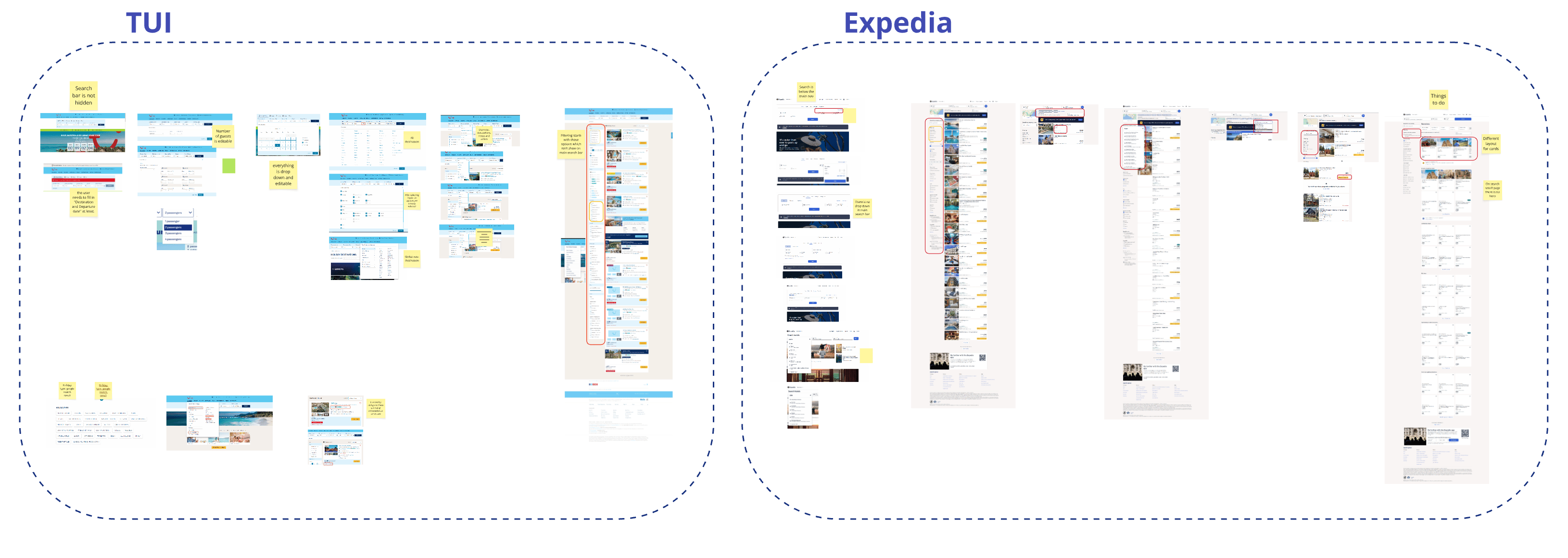
Comparative usability research
Customers started with destinations, not categories
Participants completed the same task, such as finding a holiday to Spain, on Saga and competitor platforms to identify friction points.
Key findings:
1
Customers wanted to explore before choosing a type
Users were not ready to choose a holiday type. They wanted broad results first, with the option to refine later.
2
Destination was the natural starting point
Participants began by typing a destination and often used auto-suggestions after 3-4 characters.
3
The holiday-type dropdown caused confusion
Users selected the wrong option or ignored the field. Competitor destination lists supported clearer selection.
4
Category and destination combinations created dead ends
Combining a holiday type with a destination often produced zero results, damaging confidence.
5
Filters did not support easy refinement
Results-page filters were not visible or intuitive enough to help customers refine their choices.
6
Zero results sent customers back to navigation
When searches returned no results, customers often abandoned the search bar and returned to the main navigation.
"
Too much structure, not enough intuition.
Customer research
TUI and Expedia · complete comparison artefact
Card sorting
Internal labels did not match customer expectations
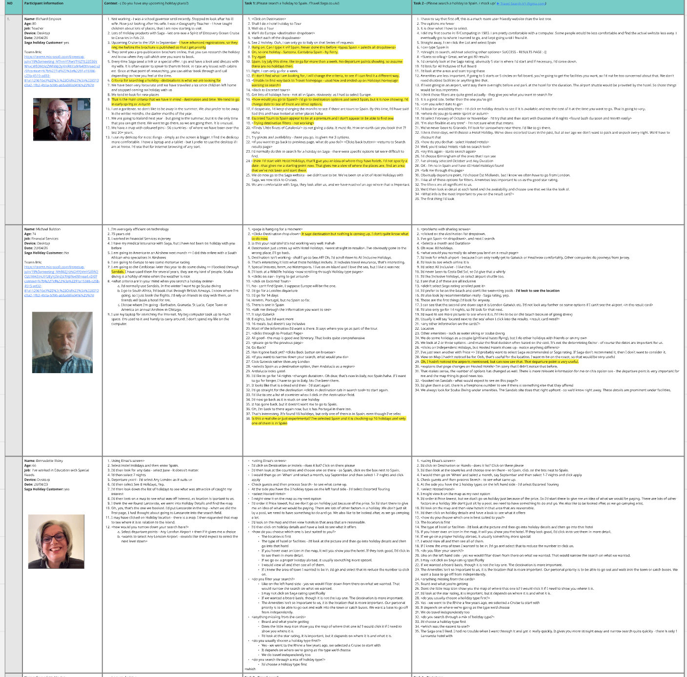
I ran card-sorting sessions to investigate how customers understood holiday types and subcategories.
- High-level categories made sense. Users could recognise broad holiday groupings without difficulty.
- Some naming was driven by internal business logic, not customer understanding. For example, Handpicked Hotels sounded “luxury” to users, while the brand team intended it to mean “carefully selected by Saga.”
Design decisions
Three decisions that made discovery simpler
The design intentionally simplified the entry point and shifted complexity to the results page, where users are in a clearer evaluation mindset.
1
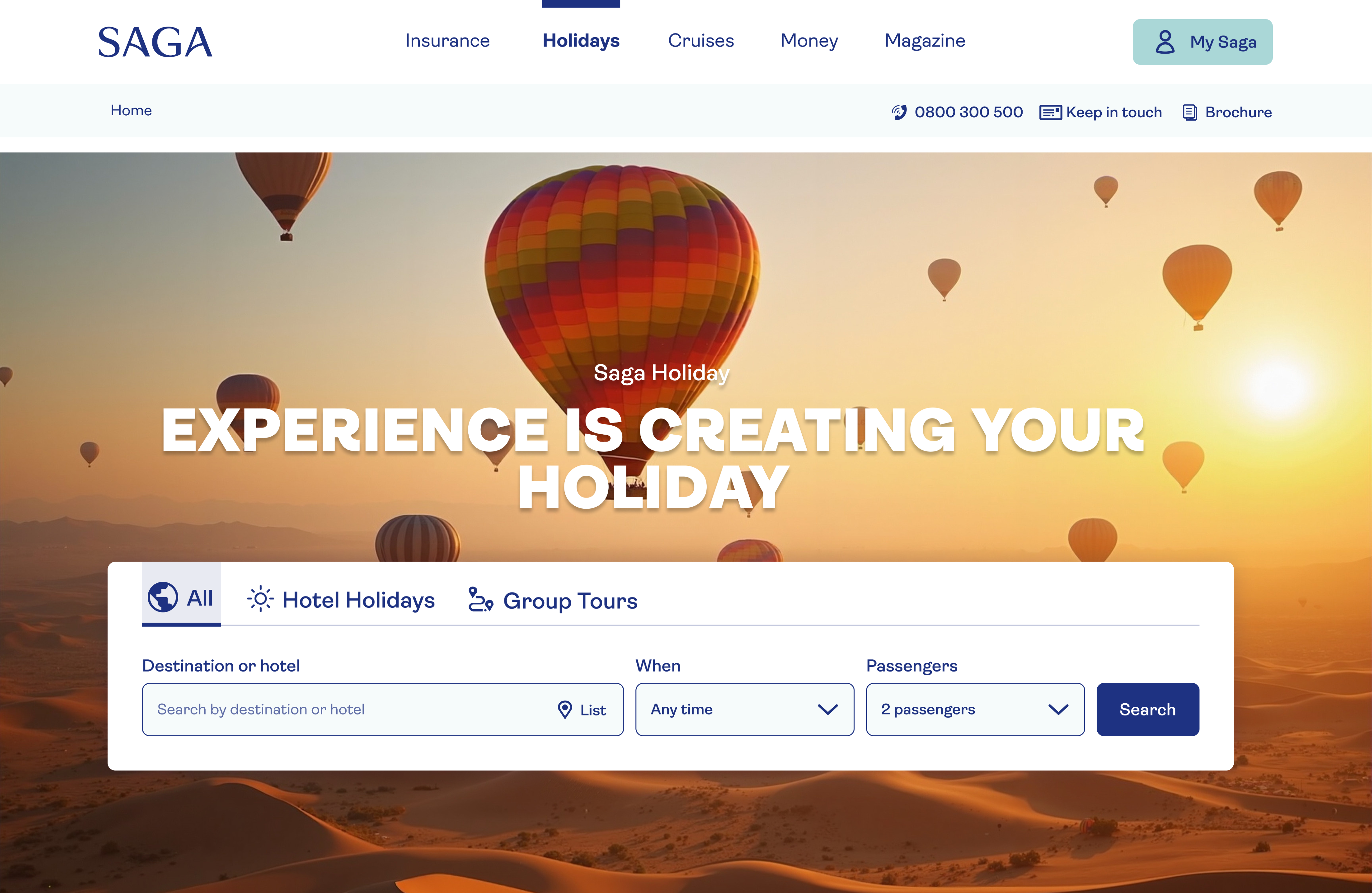
Start broad with destination-led search
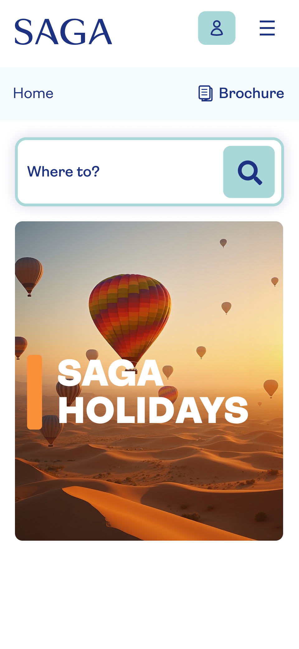
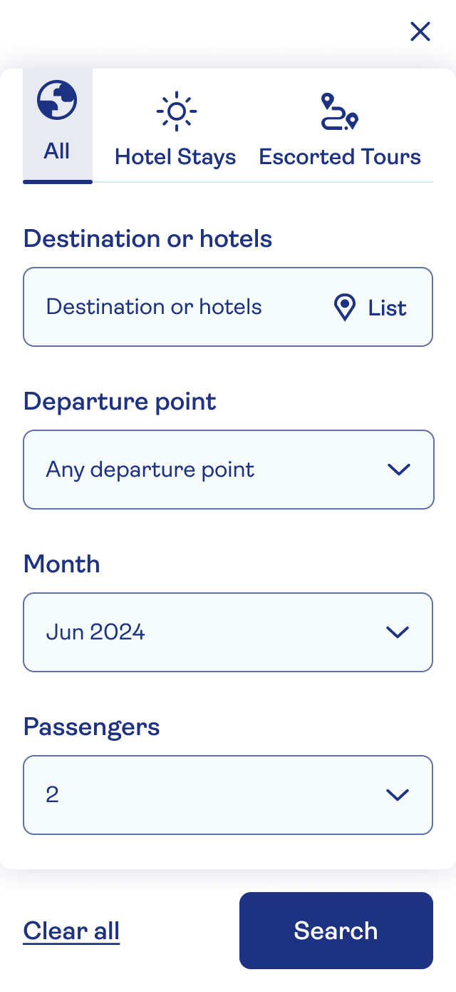
I removed deep subcategories and simplified holiday choices into All (default), Hotel Stays and Escorted Tours. This supported exploration while retaining an entry point for customers with a clear preference.
2
Move detailed decisions to the results page
I moved detailed filtering and holiday-type logic to results. The intention was to reduce the decisions customers had to make before seeing relevant options.
3
Offer a route forward when there is no exact match
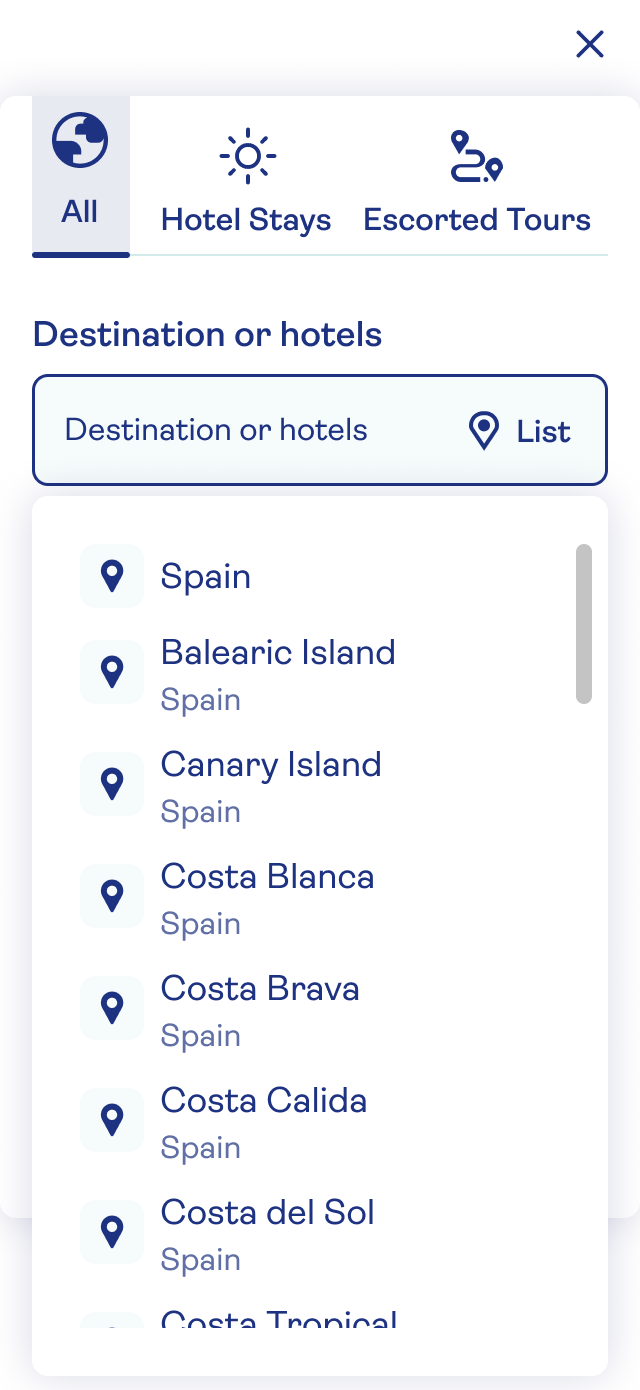
I introduced a full destination list, improved auto-suggestions and a fallback recommending similar holidays, addressing the dead ends observed during research.
Clear labels such as New, Discounted, and Customer Favourite helped users quickly assess relevance and value.
Prototype validation
A clearer route from search to results
Prototype testing provided directional feedback: participants found the flow easier to understand and reported greater confidence. A reported finding was that 80% completed searches faster, although the supplied evidence does not include sample size or comparison details.
Participants reported higher confidence in the results. The most consistent feedback was that the experience felt simple.
A/B test result
Evaluating the redesigned search experience
The redesigned search experience was tested against the existing flow in a live A/B test. The project context also included Saga's URL change from Saga Travel to Saga Holidays.
Control
Existing category-led search experience
Variant
Destination-first search with refinement on results
Search usage result
+11 percentage
Search usage increased from 24% to 35% in the reported comparison.
Evidence note: Search usage increased from 24% to 35%, an increase of 11 percentage points. Zero-result searches decreased from 7% to 4%, a reduction of 3 percentage points. Users reaching results moved from 22% to 31%, though the underlying population and comparison period need confirmation. Bookings were reported as 173 to 297, approximately 72% more observed bookings. This is not a revenue-uplift measure. Results-page filter tracking was incomplete, so qualitative and behavioural insight were also used. Traffic allocation, measurement windows and statistical confidence should be checked against the original experiment report before making stronger claims.
Back
Holiday Search Redesign
Redesigning holiday search around destination-first intent
Saga Holidays serves a wide range of products, including tours, cruises, rail journeys, hotel stays, and special-interest holidays. The search experience asked users to choose complex categories before seeing results, creating friction at the point of highest intent.
My role
Lead UX/UI
Timeline
Q1 2024
Scope
Destination-led holiday discovery
+11 pp
Search usage increased from 24% to 35%
-3 pp
Zero-result searches dropped from 7% to 4%
Context
Helping customers find the right holiday
Saga Holidays offers tours, cruises, rail journeys, hotel stays and special-interest holidays. This project focused on how customers begin a search and reach relevant results. The search experience brought together:
Destination
Travel dates and duration
Number of passengers
Holiday type
The existing entry point placed detailed categories before discovery. The goal was to help customers explore relevant holidays first and refine their choices afterwards.
Problem & evidence
Too many choices before relevant results
Data showed a significant gap between the number of users visiting Saga Holiday pages with the search bar and the number who reached search results.
- The original diagnostic snapshot recorded 1,094,560 holiday-homepage visits and 260,480 search links triggered, corresponding to approximately 24% search usage. This highlighted the need to understand where customers encountered friction.
A successful search was defined as a user reaching a results page without abandoning the journey, returning to the main navigation, or encountering a zero-result outcome.
Search Bar Behaviour
How users actually interacted with the search bar
Interaction data showed that users rarely started their journey by selecting a holiday type. Engagement was heavily skewed toward destination-led search.
- 42% started with Destination
- 15% used Time & Duration
- 6% adjusted Number of Passengers
- Only 3% selected a Holiday Type
Most users kept Destination as the default option in the first dropdown, indicating that categorisation was not a natural starting point. This revealed clear early-stage friction and cognitive load at the very first interaction with the search bar.
Stakeholder alignment
Balancing commercial categories with customer intent
- I brought stakeholders together to question a key assumption: should customers choose a holiday type before seeing results?
- Categories reflected Saga’s commercial structure.
- Holiday types showcased the product range.
- The journey assumed customers already knew their preferred type.
Success meant clearer choices and stronger progression to results.
- Increase progression to results
- Reduce zero-result searches
- Simplify early decisions
- Validate category labels
Research Approach
Understanding why customers struggled to reach relevant results
I combined moderated usability testing, card sorting and SEO review to investigate why customers struggled to reach relevant results.
- Moderated usability testing on Saga and competitors with existing and potential customers
- Card sorting to validate whether holiday type labels made sense
- SEO review to understand the real terms users search for when planning a holiday
Comparative usability research
Customers started with destinations, not categories
Participants completed the same task, such as finding a holiday to Spain, on Saga and competitor platforms to identify friction points.
Key findings:
1
Customers wanted to explore before choosing a type
Users were not ready to choose a holiday type. They wanted broad results first, with the option to refine later.
2
Destination was the natural starting point
Participants began by typing a destination and often used auto-suggestions after 3-4 characters.
3
The holiday-type dropdown caused confusion
Users selected the wrong option or ignored the field. Competitor destination lists supported clearer selection.
4
Category and destination combinations created dead ends
Combining a holiday type with a destination often produced zero results, damaging confidence.
5
Filters did not support easy refinement
Results-page filters were not visible or intuitive enough to help customers refine their choices.
6
Zero results sent customers back to navigation
When searches returned no results, customers often abandoned the search bar and returned to the main navigation.
"
Too much structure, not enough intuition.
Customer research
TUI and Expedia · complete comparison artefact
Card sorting
Internal labels did not match customer expectations
I ran card-sorting sessions to investigate how customers understood holiday types and subcategories.
- High-level categories made sense. Users could recognise broad holiday groupings without difficulty.
- Some naming was driven by internal business logic, not customer understanding. For example, Handpicked Hotels sounded “luxury” to users, while the brand team intended it to mean “carefully selected by Saga.”
Design decisions
Three decisions that made discovery simpler
The design intentionally simplified the entry point and shifted complexity to the results page, where users are in a clearer evaluation mindset.
1
Start broad with destination-led search
I removed deep subcategories and simplified holiday choices into All (default), Hotel Stays and Escorted Tours. This supported exploration while retaining an entry point for customers with a clear preference.
2
Move detailed decisions to the results page
I moved detailed filtering and holiday-type logic to results. The intention was to reduce the decisions customers had to make before seeing relevant options.
3
Offer a route forward when there is no exact match
I introduced a full destination list, improved auto-suggestions and a fallback recommending similar holidays, addressing the dead ends observed during research.
Clear labels such as New, Discounted, and Customer Favourite helped users quickly assess relevance and value.
Prototype validation
A clearer route from search to results
Prototype testing provided directional feedback: participants found the flow easier to understand and reported greater confidence. A reported finding was that 80% completed searches faster, although the supplied evidence does not include sample size or comparison details.
Participants reported higher confidence in the results. The most consistent feedback was that the experience felt simple.
A/B test result
Evaluating the redesigned search experience
The redesigned search experience was tested against the existing flow in a live A/B test. The project context also included Saga's URL change from Saga Travel to Saga Holidays.
Control
Existing category-led search experience
Variant
Destination-first search with refinement on results
Search usage result
+11 percentage
Search usage increased from 24% to 35% in the reported comparison.
Evidence note: Search usage increased from 24% to 35%, an increase of 11 percentage points. Zero-result searches decreased from 7% to 4%, a reduction of 3 percentage points. Users reaching results moved from 22% to 31%, though the underlying population and comparison period need confirmation. Bookings were reported as 173 to 297, approximately 72% more observed bookings. This is not a revenue-uplift measure. Results-page filter tracking was incomplete, so qualitative and behavioural insight were also used. Traffic allocation, measurement windows and statistical confidence should be checked against the original experiment report before making stronger claims.