
Back
Booking funnel redesign · Saga Holidays
Redesigning the holiday booking funnel for conversion and confidence
Step 1 of Saga's holiday booking funnel; from "Check Availability" through departure, transport and room selection; was losing the majority of users before they could complete a booking. My contribution spanned analytics investigation, stakeholder workshops, a calendar-first design and two usability sessions. The redesigned flow was evaluated in an A/B test.
My role
Lead UX/UI
Timeline
Q4 2024
Scope
Booking step 1
Outcome
+24% Checkout
24%
Uplift in Checkout → Confirm conversion (A/B test result)
17.6k
Users who started the funnel (Oct-Nov 2024 window)
116
Reached Confirm & Pay in the same window
Context
What the funnel asked users to do
Saga Holidays serves a primary audience of customers aged 50+. This project covered Step 1 of the booking journey; the flow a user enters after clicking "Check Availability" on a product page. That step required users to select:
Holiday dates
Departure options
Transport
Room type
The journey spread key selections across multiple slow-loading pages. Users encountered unavailable options and found it difficult to revise earlier choices.
Problem & evidence
A funnel failing users at every step
Before this project, the booking journey forced users through multiple slow-loading pages simply to see which dates were available, which rooms they could book, and what the real price would be.
!
"Unavailable" errors appeared mid-flow after users had already made selections, forcing them backwards
!
Sudden price jumps when unavailable flights defaulted to business class without clear explanation
!
Cached vs live data mismatches created inconsistent pricing and messaging between pages
!
Difficulty revising selections forced users backwards through the flow
These problems contributed to abandonment, confusion and increased reliance on call centres.
Analytics
Quantifying the drop-off
Using Adobe Analytics data from 23 Oct; 8 Nov 2024, I mapped the funnel to find where users were being lost. The numbers were stark:
17,600
Started the funnel
→
116
Reached Confirm & Pay
The top-level fallout analysis identified Checkout (departures, flights and rooms), Book & Pay, Passenger Details, Review & Pay and Confirmation as areas for investigation.
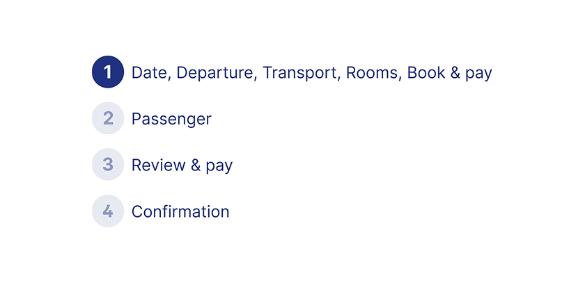
1
Checkout; departures, flights, rooms
2
Book & Pay
3
Passenger Details
4
Review & Pay
5
Confirmation
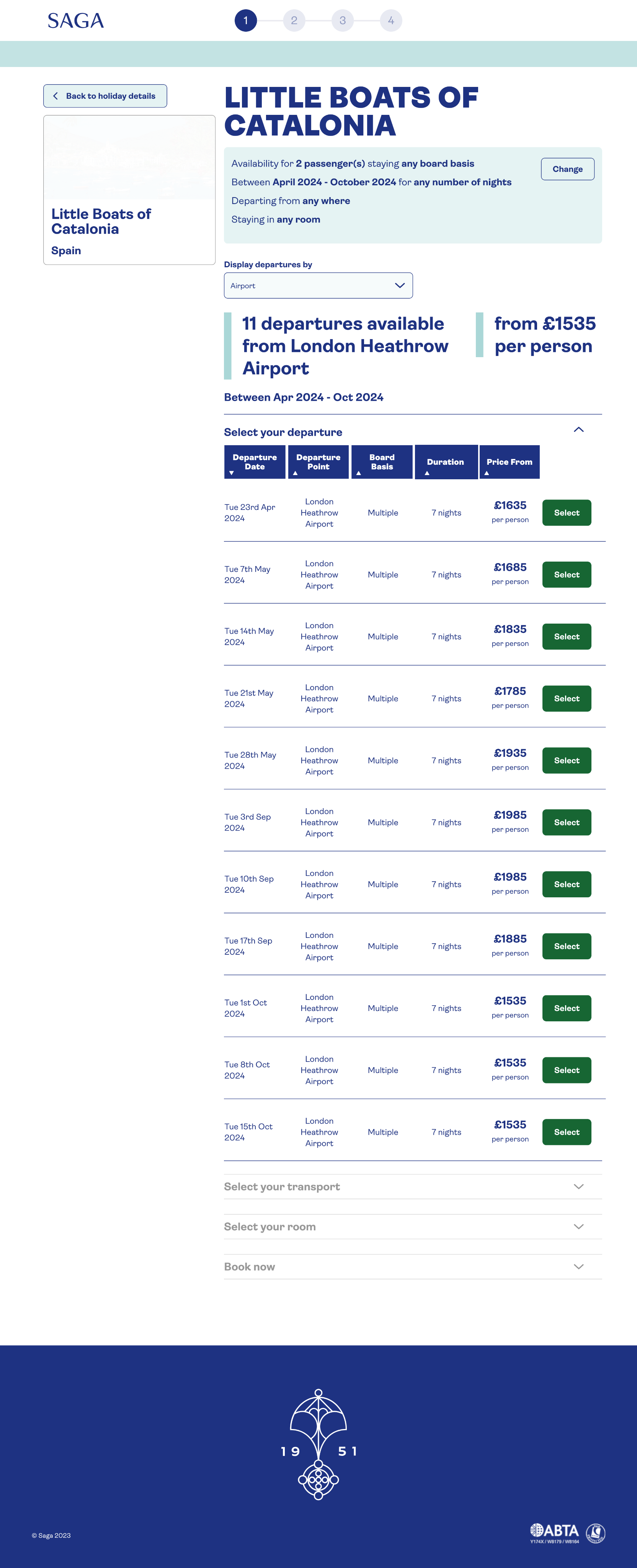
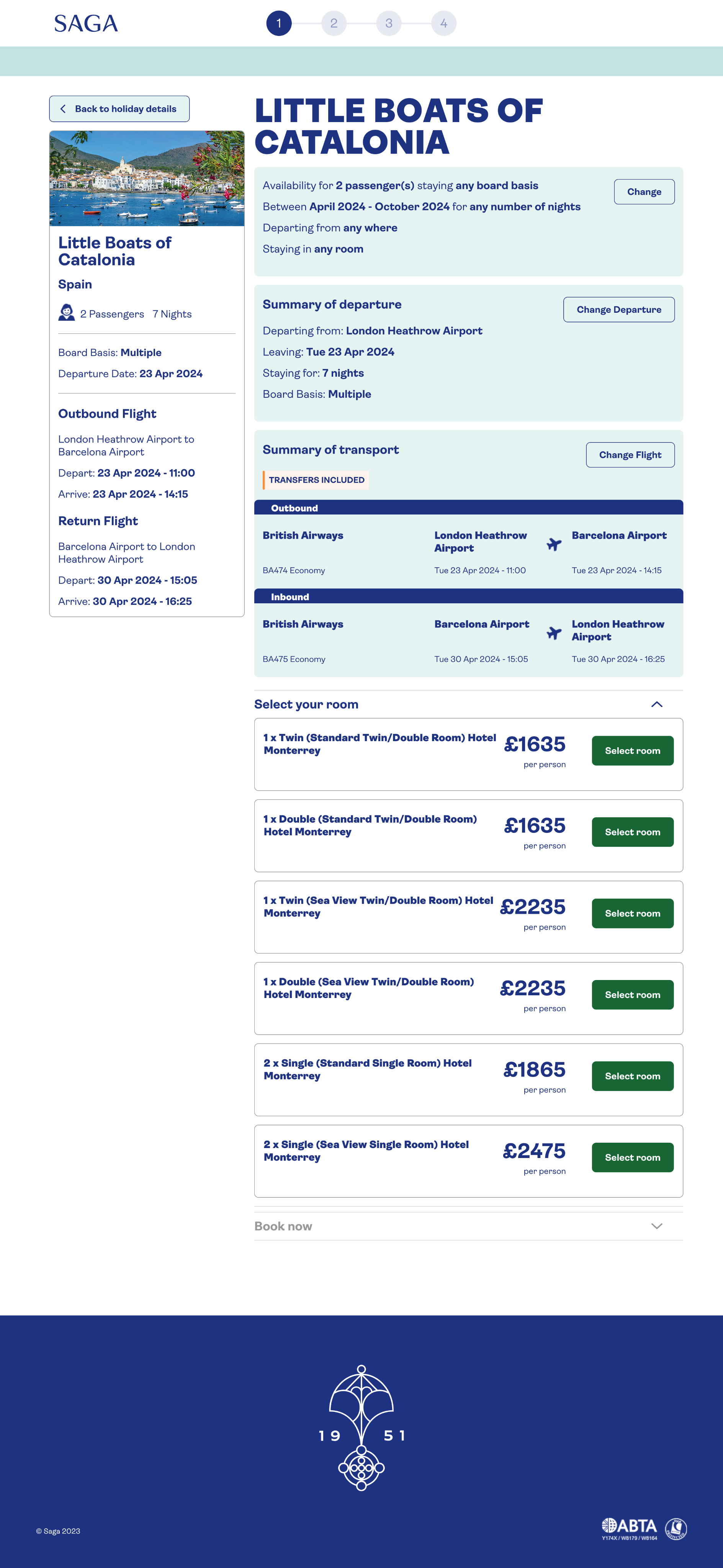
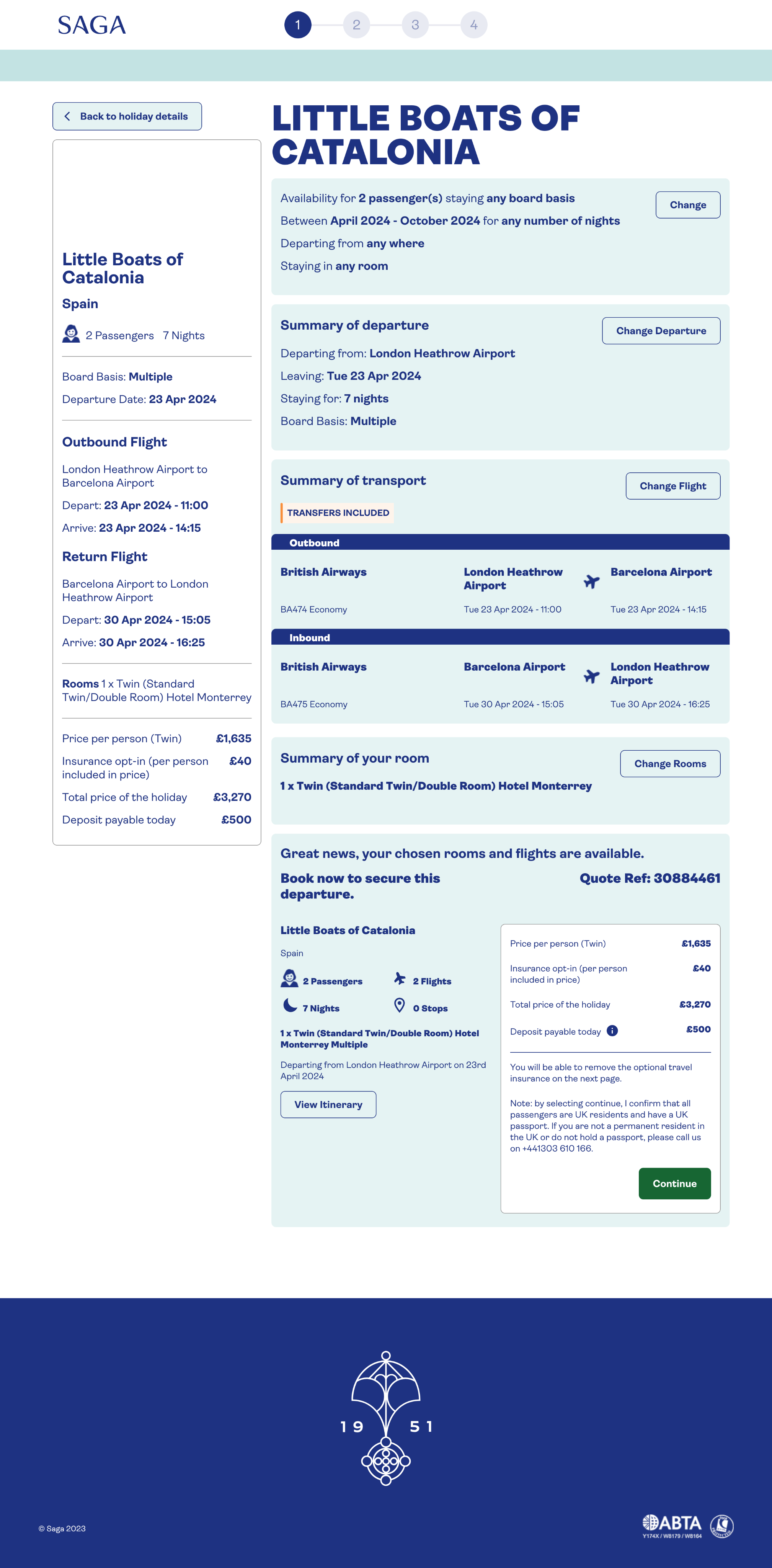
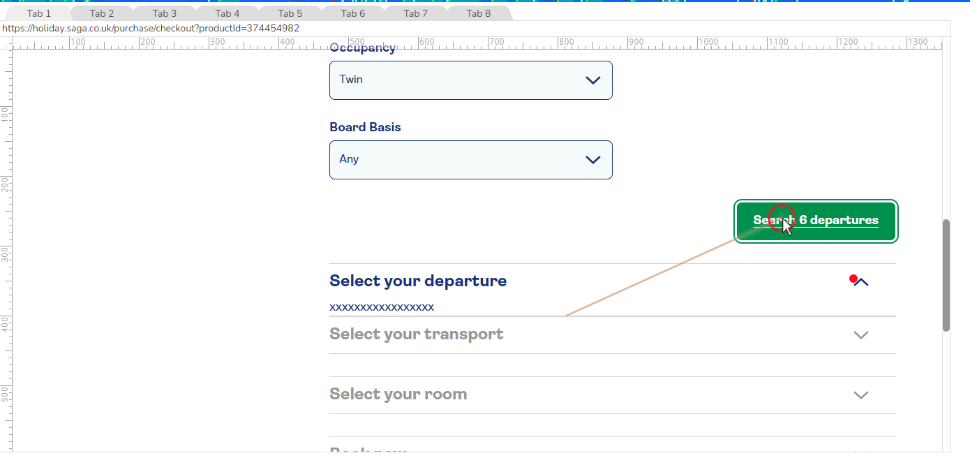
Original booking step 1 screens
Checkout
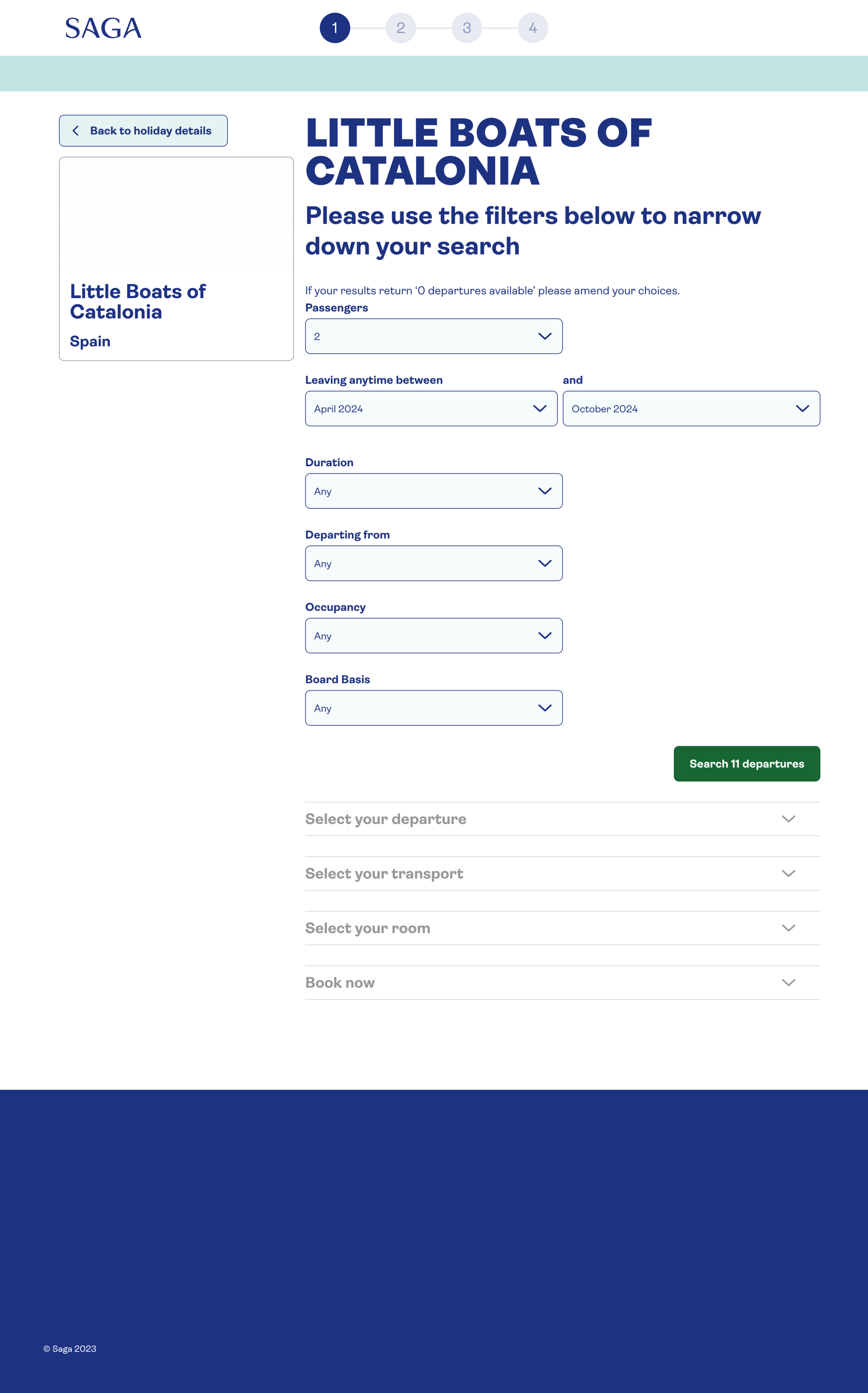
Departures
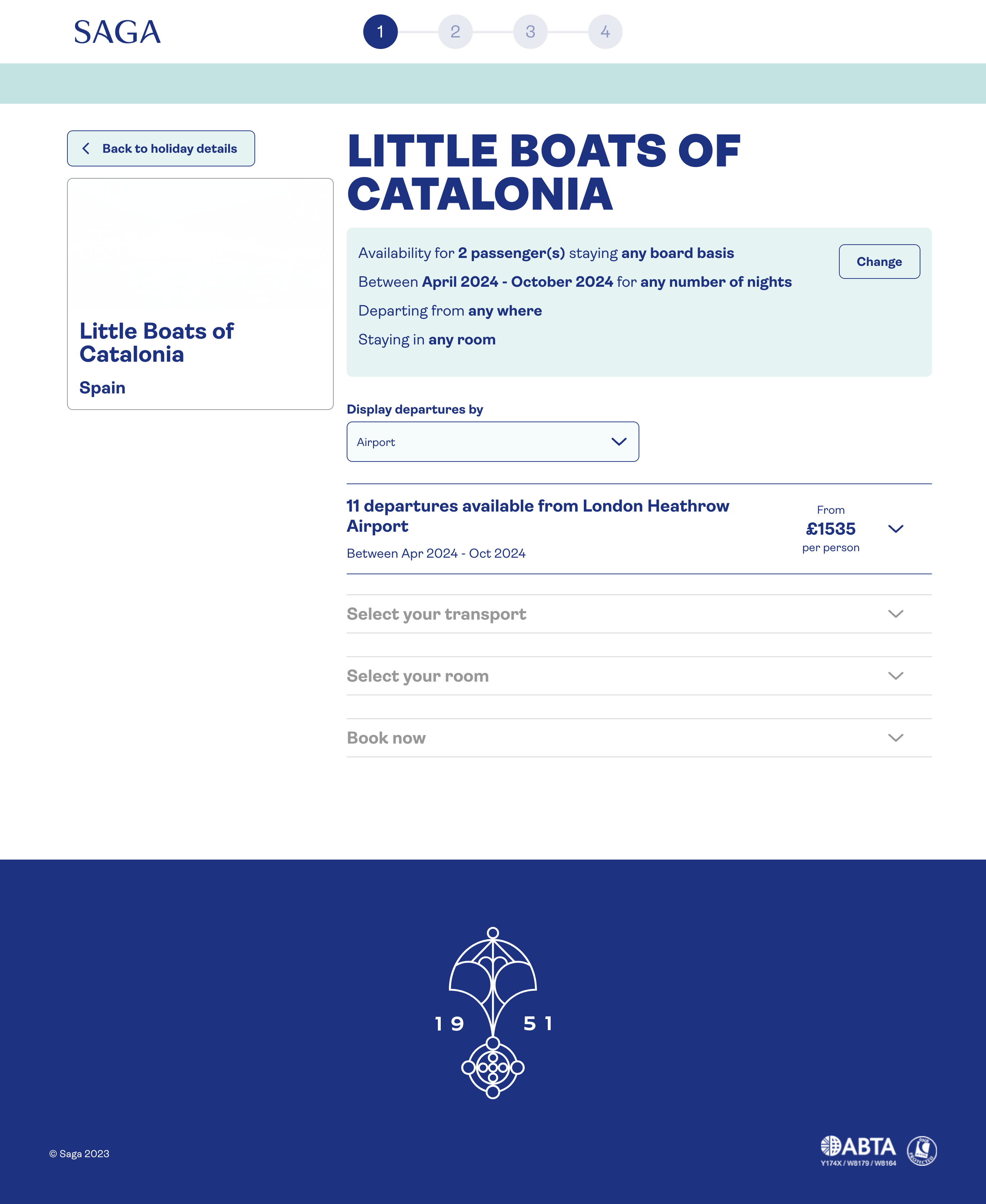
Transport
Room selection
Book & pay
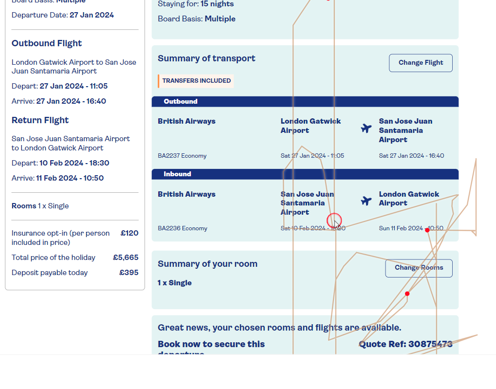
Session replays
Turning data into observed behaviour
I cross-referenced user IDs from Adobe Analytics with session recordings in Decibel to understand what was actually happening. The replays revealed patterns the funnel data alone couldn't explain:
Users in suboptimal journeys spent 15+ minutes longer in the funnel than those who found availability quickly
Unavailable flights caused sudden price jumps, especially when defaulting to business class
Cached pricing and live pricing diverged mid-journey, producing messages that contradicted each other
Users could not easily revise decisions and were forced backwards through the flow
Note on evidence:Session replays helped explain the behaviour behind the funnel drop-off. They do not establish the prevalence of each issue.
Stakeholder workshops
Building shared understanding before designing
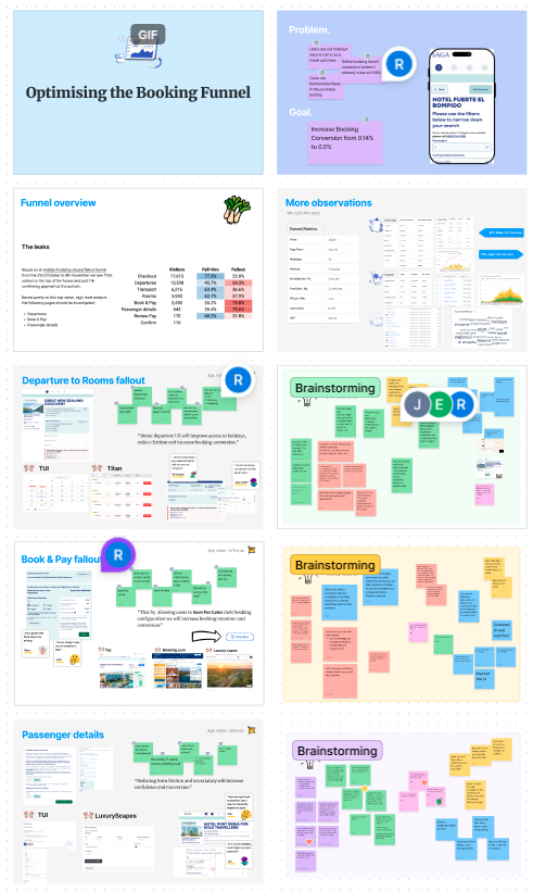
Before moving into concepts, I ran cross-functional workshops to ensure the problem framing reflected both user evidence and business/technical constraints. Participants included:
Product
Engineering
Customer Service
Business Analysis
The workshops covered the funnel overview, departures-to-rooms drop-off, Book & Pay drop-off, and passenger details. I grouped ideas from timed brainstorming through a card-sorting exercise to identify themes and priorities.
The strongest opportunity was a unified calendar experience that surfaced availability earlier and brought departures, rooms and pricing together more clearly.
A key disagreement concerned moving the consolidated selection experience one step earlier, onto the product detail page. There was reluctance to change the legacy system and established journey.
To evaluate the proposal, I carried out competitor analysis and tested a mock-up with customers, comparing the new approach with the existing journey. I then A/B tested the new approach. This brought customer feedback and behavioural evidence into the discussion.
Design decisions
From a fragmented flow to a calendar-first experience
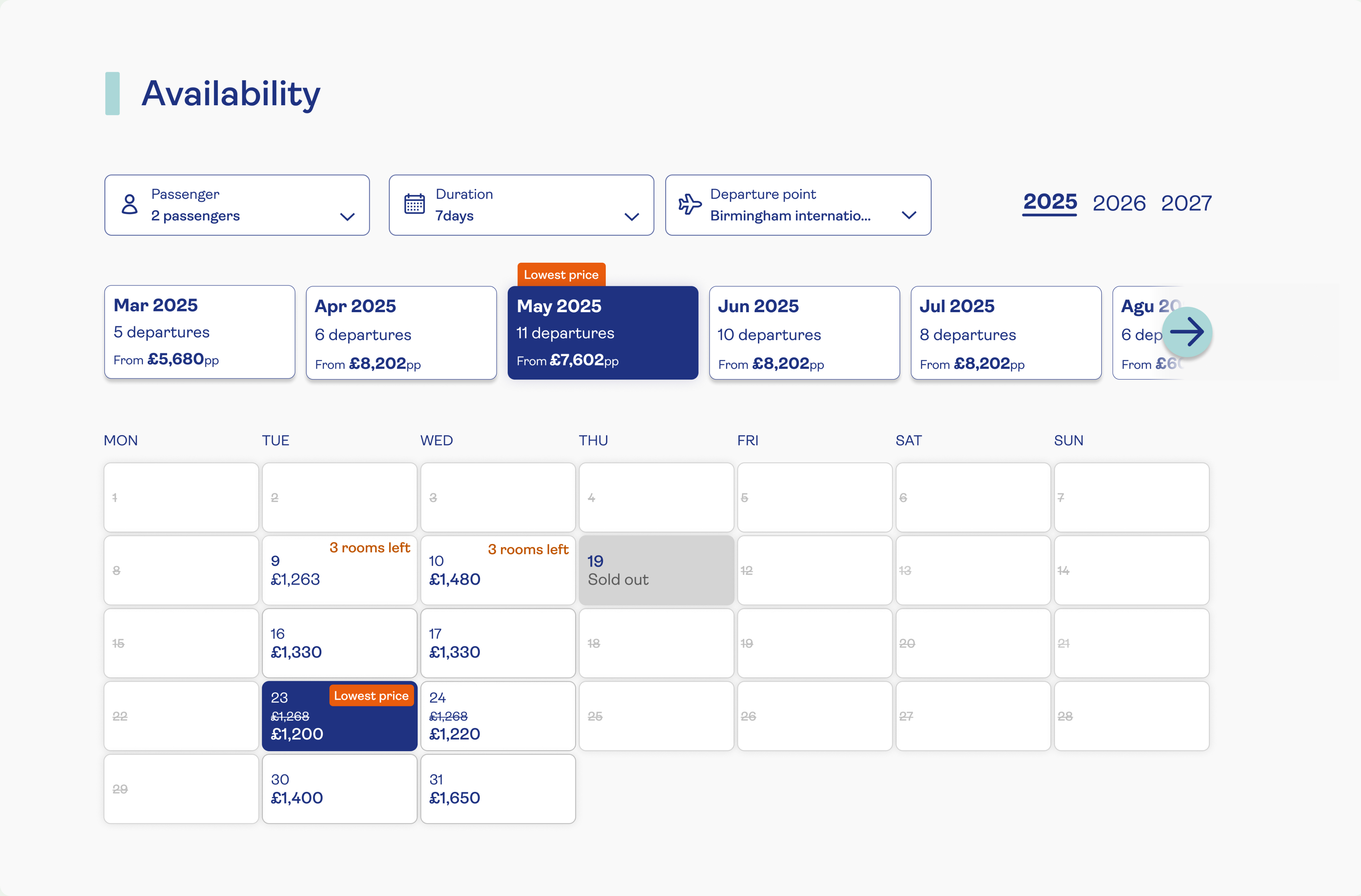
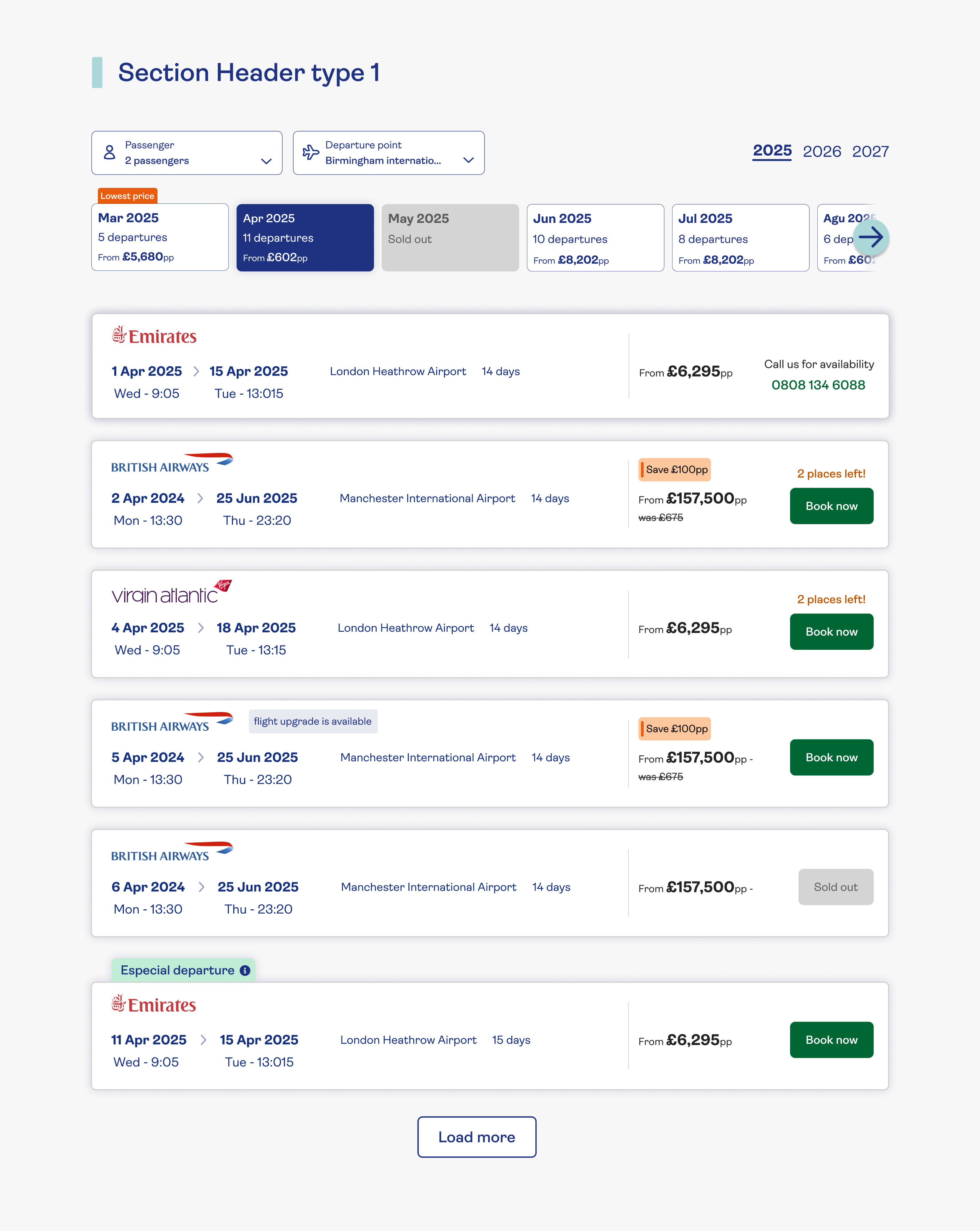
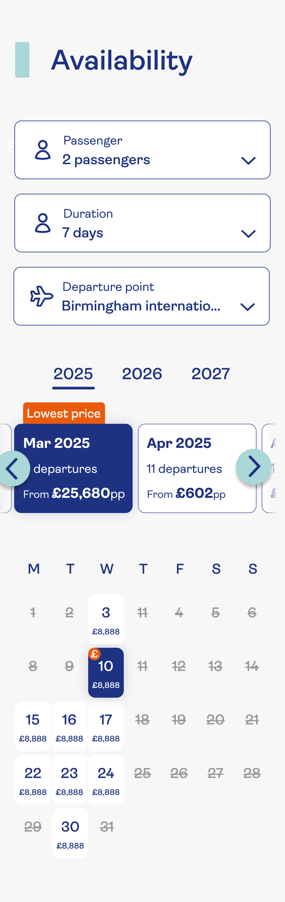
The strongest concept to emerge from ideation was a unified calendar view that consolidated what the old flow spread across multiple pages. My core design decisions were:
1
Surface availability and pricing at the calendar level
The design aimed to surface available dates and prices earlier, reducing the need to commit before understanding the options.
2
Month-carousel navigation to compare across dates
A scrollable month selector let users compare available windows quickly, rather than requesting each month sequentially
3
Departures, rooms and pricing consolidated into one view
Bringing departures, rooms and pricing together was intended to reduce page loads and make the relationship between options clearer.
4
Edit without restart
The design supported revising departure or room selections without restarting, responding to the difficulty observed in session replays.
What the design intentionally addressed:
Calendar format with month-carousel navigation
Day-level availability visible at a glance
Price visible from date selection onwards
Clearer transitions intended to reduce unavailability surprises
Ability to revise departure or room without restarting


Usability testing
Testing before shipping
I conducted two usability sessions on the prototype before moving to A/B test. The sessions focused on four questions:
Calendar format and readability for an older audience
Visibility and comprehension of the month carousel
Understanding of availability states and pricing
Ability to navigate between selections without errors
Feedback was broadly positive. Participants found the new layout clearer and less effortful than the existing flow.
"
I could see my options straight away without clicking through lots of pages
Usability session participant
"
Before, I kept getting stuck. This version just felt easier to use
Usability session participant
Note on scope:Two sessions were run. The feedback is directional; these sessions alone do not demonstrate representative usability outcomes.
A/B test result
Measuring the impact in production
The redesigned step was tested against the existing flow in a live A/B test:
Control
Traditional multi-step selection flow; separate page per selection
Variant
New calendar UI with consolidated availability access and inline pricing
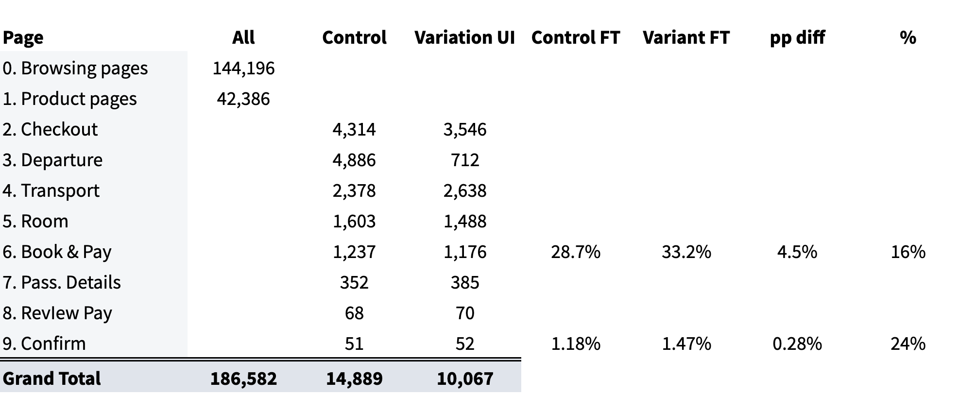
Conversion result
+24%
Uplift in Checkout → Confirm conversion (unique Confirm visitors / unique Checkout visitors)
Evidence note:Sample size, test duration and confidence interval are not available for this write-up. The 24% figure reflects the conversion measurement reported at the time of the experiment.
The original hypothesis predicted a 5% uplift across step 1. The reported result measures Checkout → Confirm conversion; the target and result should only be directly compared once their definitions are confirmed. Revenue uplift is not established by the supplied evidence.
Outcomes
What the experiment demonstrated
The A/B test result showed that redesigning step 1 of the booking funnel; specifically, how availability is surfaced and how selections are made; moved the conversion metric meaningfully. The data supports:
Reported improvement in Checkout → Confirm conversion
Qualitative signals of reduced frustration from usability sessions
A design approach that directly addressed the problems identified in session replays
The available evidence does not establish changes in downstream conversion, call-centre volume or revenue per booking. Those outcomes require their own supporting data.
Reflection
Opportunities for further evaluation
→
Instrument earlier
Evaluate downstream booking completion and revenue alongside Checkout → Confirm to understand the wider business impact.
→
Formalise usability testing criteria
Define task-success criteria and record completion rates in further usability testing to complement the directional feedback.
→
Address steps 2-4 in sequence
Investigate Book & Pay and Passenger Details as further opportunities; improvements beyond step 1 would need separate validation.
Back
Booking funnel redesign · Saga Holidays
Redesigning the holiday booking funnel for conversion and confidence
Step 1 of Saga's holiday booking funnel; from "Check Availability" through departure, transport and room selection; was losing the majority of users before they could complete a booking. My contribution spanned analytics investigation, stakeholder workshops, a calendar-first design and two usability sessions. The redesigned flow was evaluated in an A/B test.
My role
Lead UX/UI
Timeline
Q4 2024
Scope
Booking step 1
Outcome
+24% Checkout→Confirm
24%
Uplift in Checkout → Confirm conversion (A/B test result)
17.6k
Users who started the funnel (Oct-Nov 2024 window)
116
Reached Confirm & Pay in the same window
Context
What the funnel asked users to do
Saga Holidays serves a primary audience of customers aged 50+. This project covered Step 1 of the booking journey; the flow a user enters after clicking "Check Availability" on a product page. That step required users to select:
Holiday dates
Departure options
Transport
Room type
The journey spread key selections across multiple slow-loading pages. Users encountered unavailable options and found it difficult to revise earlier choices.
Problem & evidence
A funnel failing users at every step
Before this project, the booking journey forced users through multiple slow-loading pages simply to see which dates were available, which rooms they could book, and what the real price would be.
!
"Unavailable" errors appeared mid-flow after users had already made selections, forcing them backwards
!
Sudden price jumps when unavailable flights defaulted to business class without clear explanation
!
Cached vs live data mismatches created inconsistent pricing and messaging between pages
!
Difficulty revising selections forced users backwards through the flow
These problems contributed to abandonment, confusion and increased reliance on call centres.
Analytics
Quantifying the drop-off
Using Adobe Analytics data from 23 Oct; 8 Nov 2024, I mapped the funnel to find where users were being lost. The numbers were stark:
17,600
Started the funnel
→
116
Reached Confirm & Pay
The top-level fallout analysis identified Checkout (departures, flights and rooms), Book & Pay, Passenger Details, Review & Pay and Confirmation as areas for investigation.
1
Checkout; departures, flights, rooms
Priority for investigation
2
Book & Pay
3
Passenger Details
4
Review & Pay
5
Confirmation
Original booking step 1 screens
Checkout
Departures
Transport
Room selection
Book & pay
Session replays
Turning data into observed behaviour
I cross-referenced user IDs from Adobe Analytics with session recordings in Decibel to understand what was actually happening. The replays revealed patterns the funnel data alone couldn't explain:
Users in suboptimal journeys spent 15+ minutes longer in the funnel than those who found availability quickly
Unavailable flights caused sudden price jumps, especially when defaulting to business class
Cached pricing and live pricing diverged mid-journey, producing messages that contradicted each other
Users could not easily revise decisions and were forced backwards through the flow
Note on evidence:Session replays helped explain the behaviour behind the funnel drop-off. They do not establish the prevalence of each issue.
Stakeholder workshops
Building shared understanding before designing
Before moving into concepts, I ran cross-functional workshops to ensure the problem framing reflected both user evidence and business/technical constraints. Participants included:
Product
Engineering
Customer Service
Business Analysis
The workshops covered the funnel overview, departures-to-rooms drop-off, Book & Pay drop-off, and passenger details. I grouped ideas from timed brainstorming through a card-sorting exercise to identify themes and priorities.
The strongest opportunity was a unified calendar experience that surfaced availability earlier and brought departures, rooms and pricing together more clearly.
A key disagreement concerned moving the consolidated selection experience one step earlier, onto the product detail page. There was reluctance to change the legacy system and established journey.
To evaluate the proposal, I carried out competitor analysis and tested a mock-up with customers, comparing the new approach with the existing journey. I then A/B tested the new approach. This brought customer feedback and behavioural evidence into the discussion.
Design decisions
From a fragmented flow to a calendar-first experience
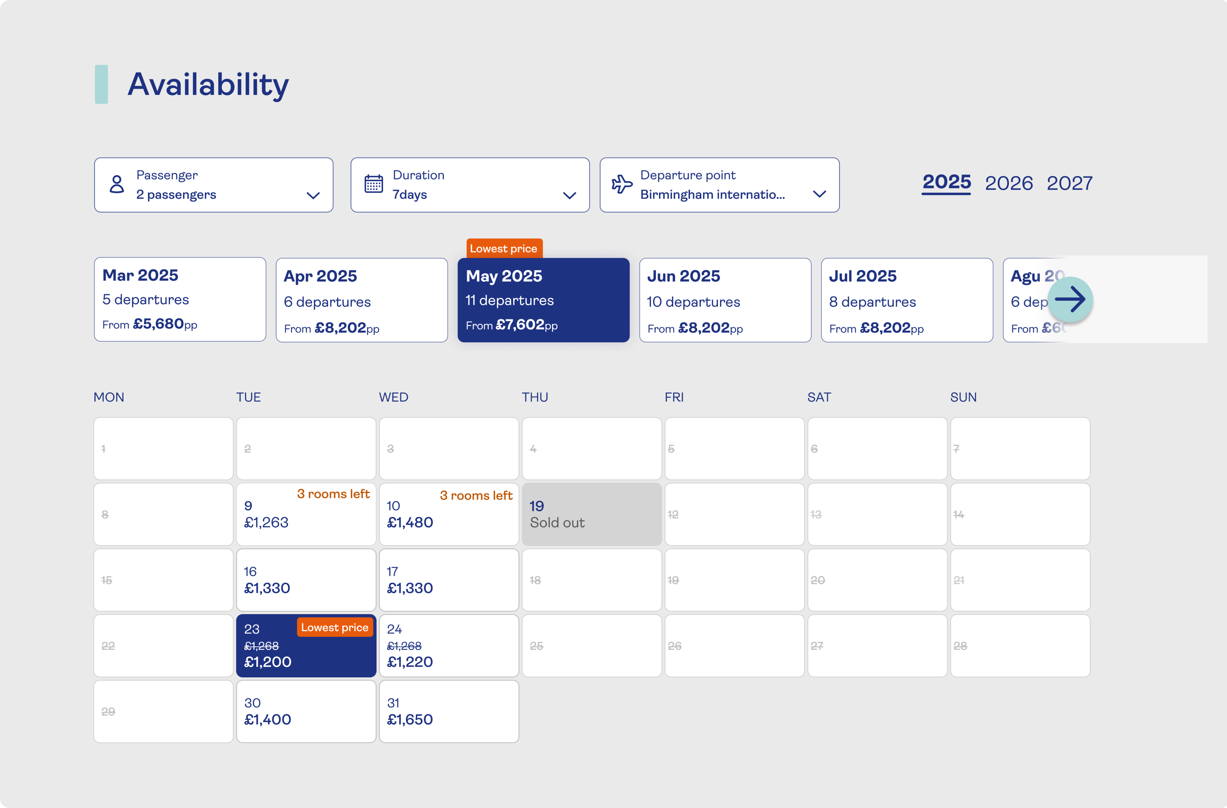
The strongest concept to emerge from ideation was a unified calendar view that consolidated what the old flow spread across multiple pages. My core design decisions were:
1
Surface availability and pricing at the calendar level
The design aimed to surface available dates and prices earlier, reducing the need to commit before understanding the options.
2
Month-carousel navigation to compare across dates
A scrollable month selector let users compare available windows quickly, rather than requesting each month sequentially
3
Departures, rooms and pricing consolidated into one view
Bringing departures, rooms and pricing together was intended to reduce page loads and make the relationship between options clearer.
4
Edit without restart
The design supported revising departure or room selections without restarting, responding to the difficulty observed in session replays.
What the design intentionally addressed:
Calendar format with month-carousel navigation
Day-level availability visible at a glance
Price visible from date selection onwards
Clearer transitions intended to reduce unavailability surprises
Ability to revise departure or room without restarting
Usability testing
Testing before shipping
I conducted two usability sessions on the prototype before moving to A/B test. The sessions focused on four questions:
Calendar format and readability for an older audience
Visibility and comprehension of the month carousel
Understanding of availability states and pricing
Ability to navigate between selections without errors
Feedback was broadly positive. Participants found the new layout clearer and less effortful than the existing flow.
"
I could see my options straight away without clicking through lots of pages
Usability session participant
"
Before, I kept getting stuck. This version just felt easier to use
Usability session participant
Note on scope:Two sessions were run. The feedback is directional; these sessions alone do not demonstrate representative usability outcomes.
A/B test result
Measuring the impact in production
The redesigned step was tested against the existing flow in a live A/B test:
Control
Traditional multi-step selection flow; separate page per selection
Variant
New calendar UI with consolidated availability access and inline pricing
Conversion result
+24%
Uplift in Checkout → Confirm conversion (unique Confirm visitors / unique Checkout visitors)
Evidence note:Sample size, test duration and confidence interval are not available for this write-up. The 24% figure reflects the conversion measurement reported at the time of the experiment.
The original hypothesis predicted a 5% uplift across step 1. The reported result measures Checkout → Confirm conversion; the target and result should only be directly compared once their definitions are confirmed. Revenue uplift is not established by the supplied evidence.
Outcomes
What the experiment demonstrated
The A/B test result showed that redesigning step 1 of the booking funnel; specifically, how availability is surfaced and how selections are made; moved the conversion metric meaningfully. The data supports:
Reported improvement in Checkout → Confirm conversion
Qualitative signals of reduced frustration from usability sessions
A design approach that directly addressed the problems identified in session replays
The available evidence does not establish changes in downstream conversion, call-centre volume or revenue per booking. Those outcomes require their own supporting data.
Reflection
Opportunities for further evaluation
→
Instrument earlier
Evaluate downstream booking completion and revenue alongside Checkout → Confirm to understand the wider business impact.
→
Formalise usability testing criteria
Define task-success criteria and record completion rates in further usability testing to complement the directional feedback.
→
Address steps 2-4 in sequence
Investigate Book & Pay and Passenger Details as further opportunities; improvements beyond step 1 would need separate validation.
Booking funnel redesign · Saga Holidays
Redesigning the holiday booking funnel for conversion and confidence
Step 1 of Saga's holiday booking funnel; from "Check Availability" through departure, transport and room selection; was losing the majority of users before they could complete a booking. My contribution spanned analytics investigation, stakeholder workshops, a calendar-first design and two usability sessions. The redesigned flow was evaluated in an A/B test.
My role
Lead UX/UI
Timeline
Q4 2024
Scope
Booking step 1
Outcome
+24% Checkout→Confirm
24%
Uplift in Checkout → Confirm conversion (A/B test result)
17.6k
Users who started the funnel (Oct-Nov 2024 window)
116
Reached Confirm & Pay in the same window
Context
What the funnel asked users to do
Saga Holidays serves a primary audience of customers aged 50+. This project covered Step 1 of the booking journey; the flow a user enters after clicking "Check Availability" on a product page. That step required users to select:
Holiday dates
Departure options
Transport
Room type
The journey spread key selections across multiple slow-loading pages. Users encountered unavailable options and found it difficult to revise earlier choices.
Problem & evidence
A funnel failing users at every step
Before this project, the booking journey forced users through multiple slow-loading pages simply to see which dates were available, which rooms they could book, and what the real price would be.
!
"Unavailable" errors appeared mid-flow after users had already made selections, forcing them backwards
!
Sudden price jumps when unavailable flights defaulted to business class without clear explanation
!
Cached vs live data mismatches created inconsistent pricing and messaging between pages
!
Difficulty revising selections forced users backwards through the flow
These problems contributed to abandonment, confusion and increased reliance on call centres.
Analytics
Quantifying the drop-off
Using Adobe Analytics data from 23 Oct; 8 Nov 2024, I mapped the funnel to find where users were being lost. The numbers were stark:
17,600
Started the funnel
→
116
Reached Confirm & Pay
The top-level fallout analysis identified Checkout (departures, flights and rooms), Book & Pay, Passenger Details, Review & Pay and Confirmation as areas for investigation.
1
Checkout; departures, flights, rooms
Priority for investigation
2
Book & Pay
3
Passenger Details
4
Review & Pay
5
Confirmation
Original booking step 1 screens
Checkout
Departures
Transport
Room selection
Book & pay
Session replays
Turning data into observed behaviour
I cross-referenced user IDs from Adobe Analytics with session recordings in Decibel to understand what was actually happening. The replays revealed patterns the funnel data alone couldn't explain:
Users in suboptimal journeys spent 15+ minutes longer in the funnel than those who found availability quickly
Unavailable flights caused sudden price jumps, especially when defaulting to business class
Cached pricing and live pricing diverged mid-journey, producing messages that contradicted each other
Users could not easily revise decisions and were forced backwards through the flow
Note on evidence:Session replays helped explain the behaviour behind the funnel drop-off. They do not establish the prevalence of each issue.
Stakeholder workshops
Building shared understanding before designing
Before moving into concepts, I ran cross-functional workshops to ensure the problem framing reflected both user evidence and business/technical constraints. Participants included:
Product
Engineering
Customer Service
Business Analysis
The workshops covered the funnel overview, departures-to-rooms drop-off, Book & Pay drop-off, and passenger details. I grouped ideas from timed brainstorming through a card-sorting exercise to identify themes and priorities.
The strongest opportunity was a unified calendar experience that surfaced availability earlier and brought departures, rooms and pricing together more clearly.
A key disagreement concerned moving the consolidated selection experience one step earlier, onto the product detail page. There was reluctance to change the legacy system and established journey.
To evaluate the proposal, I carried out competitor analysis and tested a mock-up with customers, comparing the new approach with the existing journey. I then A/B tested the new approach. This brought customer feedback and behavioural evidence into the discussion.
Design decisions
From a fragmented flow to a calendar-first experience
The strongest concept to emerge from ideation was a unified calendar view that consolidated what the old flow spread across multiple pages. My core design decisions were:
1
Surface availability and pricing at the calendar level
The design aimed to surface available dates and prices earlier, reducing the need to commit before understanding the options.
2
Month-carousel navigation to compare across dates
A scrollable month selector let users compare available windows quickly, rather than requesting each month sequentially
3
Departures, rooms and pricing consolidated into one view
Bringing departures, rooms and pricing together was intended to reduce page loads and make the relationship between options clearer.
4
Edit without restart
The design supported revising departure or room selections without restarting, responding to the difficulty observed in session replays.
What the design intentionally addressed:
Calendar format with month-carousel navigation
Day-level availability visible at a glance
Price visible from date selection onwards
Clearer transitions intended to reduce unavailability surprises
Ability to revise departure or room without restarting
Usability testing
Testing before shipping
I conducted two usability sessions on the prototype before moving to A/B test. The sessions focused on four questions:
Calendar format and readability for an older audience
Visibility and comprehension of the month carousel
Understanding of availability states and pricing
Ability to navigate between selections without errors
Feedback was broadly positive. Participants found the new layout clearer and less effortful than the existing flow.
"
I could see my options straight away without clicking through lots of pages
Usability session participant
"
Before, I kept getting stuck. This version just felt easier to use
Usability session participant
Note on scope:Two sessions were run. The feedback is directional; these sessions alone do not demonstrate representative usability outcomes.
A/B test result
Measuring the impact in production
The redesigned step was tested against the existing flow in a live A/B test:
Control
Traditional multi-step selection flow; separate page per selection
Variant
New calendar UI with consolidated availability access and inline pricing
Conversion result
+24%
Uplift in Checkout → Confirm conversion (unique Confirm visitors / unique Checkout visitors)
Evidence note:Sample size, test duration and confidence interval are not available for this write-up. The 24% figure reflects the conversion measurement reported at the time of the experiment.
The original hypothesis predicted a 5% uplift across step 1. The reported result measures Checkout → Confirm conversion; the target and result should only be directly compared once their definitions are confirmed. Revenue uplift is not established by the supplied evidence.
Outcomes
What the experiment demonstrated
The A/B test result showed that redesigning step 1 of the booking funnel; specifically, how availability is surfaced and how selections are made; moved the conversion metric meaningfully. The data supports:
Reported improvement in Checkout → Confirm conversion
Qualitative signals of reduced frustration from usability sessions
A design approach that directly addressed the problems identified in session replays
The available evidence does not establish changes in downstream conversion, call-centre volume or revenue per booking. Those outcomes require their own supporting data.
Reflection
Opportunities for further evaluation
→
Instrument earlier
Evaluate downstream booking completion and revenue alongside Checkout → Confirm to understand the wider business impact.
→
Formalise usability testing criteria
Define task-success criteria and record completion rates in further usability testing to complement the directional feedback.
→
Address steps 2-4 in sequence
Investigate Book & Pay and Passenger Details as further opportunities; improvements beyond step 1 would need separate validation.