Email sign-up · Saga Holidays
Earning email consent without interrupting holiday discovery
Moving beyond a footer-only form to a visible, contextual invitation. I designed three sign-up placements to support customer-data capture while keeping holiday browsing in focus. The redesign delivered a clear jump in CRM-reported net email sign-ups.
Launch
1 July 2026
Scope
Three contextual placements
Evaluation
50/50 targeted split
My contribution: experience strategy, component design and test approach. CRM results are presented as reported net email sign-ups.
Target for net-new email consents
250k
Business acquisition target
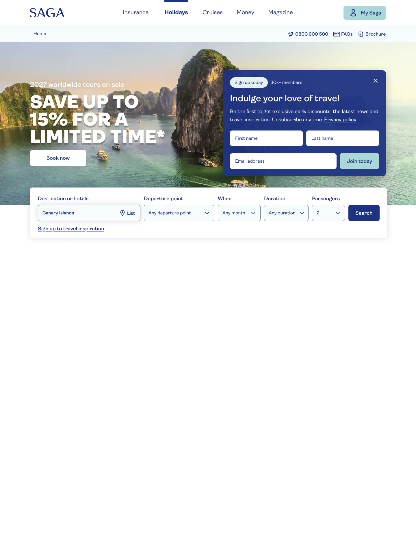
Historical desktop landing design. The email invitation shares the hero with the promotion and “Book now” CTA.
Context
An invitation too easy to miss
Before the redesign, a simple sign-up form sat at the bottom of all landing pages. Capturing new customer data depended on visitors reaching the footer, away from the moments when they were actively discovering holidays. The redesign moved the invitation into the journey.
The legacy system required first name and last name alongside email address. These fields were a system constraint, rather than additional data requested for this redesign.
The design opportunity
Bring the invitation into the journey rather than asking customers to find it at the end of the page.
Design principle
Be visible, not interruptive
I chose not to use a pop-up. Prior experience with Saga’s older customers suggested that distractions were unwelcome and that people needed time to digest information. This informed the approach; it was not a new formal research study.
A straightforward invitation, with room to keep exploring.
Design intent: make the value clear without taking over the browsing experience.
The components explain the benefit, offer unsubscribe-anytime wording and provide privacy-policy access. Hero and product-page close controls give customers an option to dismiss.
Design decisions
Three ways into the same invitation
I introduced contextual components in the landing, product and search journeys. Each made sign-up more visible without a pop-up, but the placement and customer control differed.
Hero: meet customers at discovery
A prominent, closable invitation sits beside the desktop promotional message. On mobile, the component moves below the hero image, keeping the promotion and booking CTA ahead of the form.
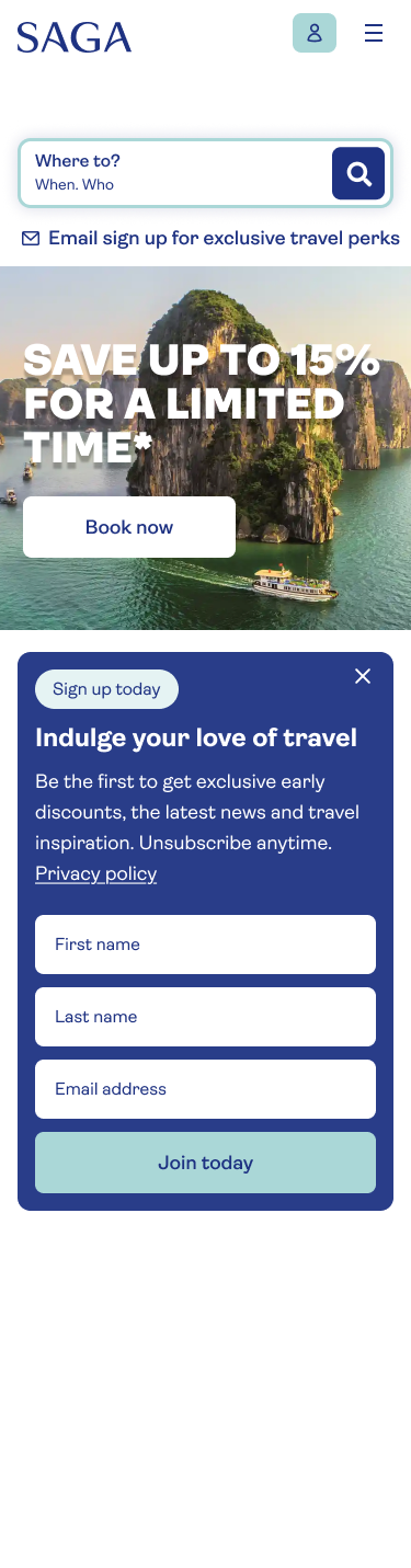
Mobile landing: below the image, with the complete form and close control.
Product page: a full-width invitation
The component sits within the product page, below the image gallery and in-page navigation. A close control lets customers dismiss it and continue considering the holiday.
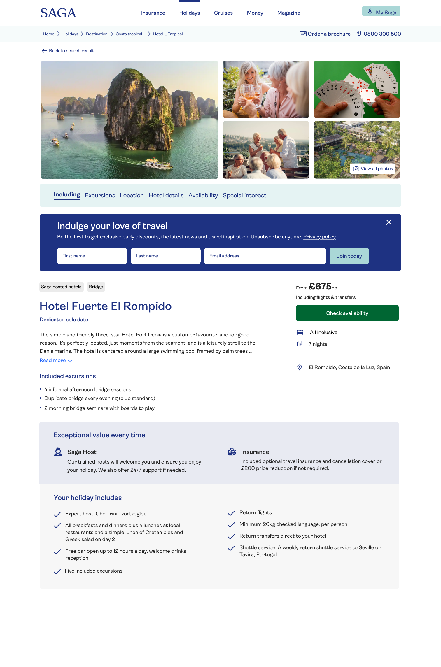
Product-page crop includes the full sign-up unit and “Check availability” CTA.
Search journey: part of the results
An inline, non-dismissible sign-up unit appears among holiday results. It remains in the page flow rather than blocking access to the results.
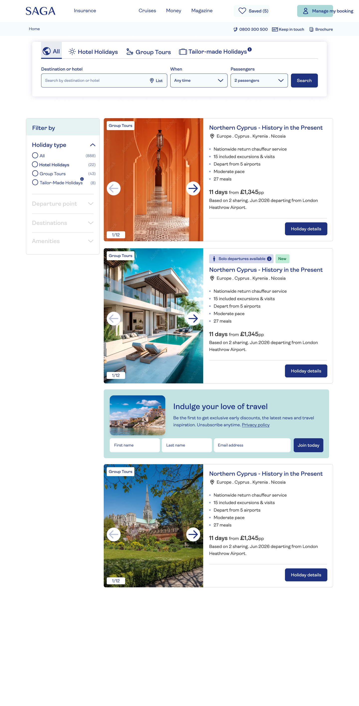
Desktop search: the invitation sits between results, not inside the search bar.

Mobile search keeps the image, explanatory copy and all fields in one stacked unit.
Screenshots are historical product mock-ups. Their member counts, prices and demo copy are not project outcome metrics. CRM results are presented separately.
Test approach
More visible sign-up, but at what cost?
The hero supports email acquisition, but it also competes with the promotional message and booking CTA. I began with a 50/50 targeted split test to evaluate that risk rather than assuming more visibility would be an unqualified improvement.
Experience
Sign-up visibility
Before
Simple form at the bottom of landing pages.
New design
Contextual hero, product-page and search-journey invitations.
50/50
A targeted split to evaluate the acquisition opportunity against the hero’s commercial role.
Protecting the hero’s commercial role
The 50/50 targeted split test reported no impact on the hero’s commercial conversion rate. This guardrail result is separate from the pre/post-launch CRM sign-up comparison.
Observed results
Nearly four times the monthly sign-ups
Following the 1 July 2026 launch, the CRM report shows a sustained increase in Holidays net email sign-ups. The comparison uses the reported monthly averages before and after launch.
AVERAGE MONTHLY NET EMAIL SIGN-UPS
3.7×
807 → 2,958 per month
Mar-Jun 2026 compared with July 2026 to report date
Before launch · Mar-Jun 2026
807 average per month
After launch · July 2026 to report date
2958 average per month
11,830
Net email sign-ups since launch
July 2026 to report date
32.8%
Share of all recorded sign-ups since March 2023
11,830 of 36,062 CRM-reported net email sign-ups
Placement performance
The placement report shows the share of sign-ups attributed to each component. These figures are a separate measure from the CRM averages and totals shown above.
Share of sign-ups by placement
Values total 100.1% and are shown as reported; the difference is due to rounding.
Hero component
87%
Product details component
11.2%
Search component
1.9%
Reported test outcome
A 50/50 targeted split test showed no impact on the hero commercial conversion rate.
Source: CRM Holidays net email sign-up report. The post-launch period includes October 2026 to the reporting date.
Next evaluation
Measure acquisition and discovery together
With acquisition growing, the next step is to understand which placements and devices contribute most while monitoring the holiday journey.
Compare placement performance
Track the contribution of hero, product-page and search invitations to net email sign-ups.
Understand device performance
Compare the contribution and usability of desktop and mobile placements.
Continue monitoring the hero
Continue tracking commercial conversion alongside sign-up performance as placements evolve.
Protect the holiday journey
Continue monitoring hero commercial conversion and the wider booking journey alongside sign-up performance.
More visible invitations, with customer control. CRM reporting shows higher monthly acquisition following the July launch.
Email sign-up · Saga Holidays
Earning email consent without interrupting holiday discovery
Moving beyond a footer-only form to a visible, contextual invitation. I designed three sign-up placements to support customer-data capture while keeping holiday browsing in focus. The redesign delivered a clear jump in CRM-reported net email sign-ups.
Launch
1 July 2026
Scope
Three contextual placements
Evaluation
50/50 targeted split
My contribution: experience strategy, component design and test approach. CRM results are presented as reported net email sign-ups.
Target for net-new email consents
250k
Business acquisition target
Historical desktop landing design. The email invitation shares the hero with the promotion and “Book now” CTA.
Context
An invitation too easy to miss
Before the redesign, a simple sign-up form sat at the bottom of all landing pages. Capturing new customer data depended on visitors reaching the footer, away from the moments when they were actively discovering holidays. The redesign moved the invitation into the journey.
The legacy system required first name and last name alongside email address. These fields were a system constraint, rather than additional data requested for this redesign.
The design opportunity
Bring the invitation into the journey rather than asking customers to find it at the end of the page.
Design principle
Be visible, not interruptive
I chose not to use a pop-up. Prior experience with Saga’s older customers suggested that distractions were unwelcome and that people needed time to digest information. This informed the approach; it was not a new formal research study.
A straightforward invitation, with room to keep exploring.
Design intent: make the value clear without taking over the browsing experience.
The components explain the benefit, offer unsubscribe-anytime wording and provide privacy-policy access. Hero and product-page close controls give customers an option to dismiss.
Design decisions
Three ways into the same invitation
I introduced contextual components in the landing, product and search journeys. Each made sign-up more visible without a pop-up, but the placement and customer control differed.
Hero: meet customers at discovery
A prominent, closable invitation sits beside the desktop promotional message. On mobile, the component moves below the hero image, keeping the promotion and booking CTA ahead of the form.
Mobile landing: below the image, with the complete form and close control.
Preserve the browsing context
The holiday image and “Book now” remain visible before the mobile invitation.
Let customers move on
The close control is part of the hero component on both desktop and mobile.
Product page: a full-width invitation
The component sits within the product page, below the image gallery and in-page navigation. A close control lets customers dismiss it and continue considering the holiday.
Product-page crop includes the full sign-up unit and “Check availability” CTA.
Search journey: part of the results
An inline, non-dismissible sign-up unit appears among holiday results. It remains in the page flow rather than blocking access to the results.
Desktop search: the invitation sits between results, not inside the search bar.
Mobile search keeps the image, explanatory copy and all fields in one stacked unit.
Screenshots are historical product mock-ups. Their member counts, prices and demo copy are not project outcome metrics. CRM results are presented separately.
Test approach
More visible sign-up, but at what cost?
The hero supports email acquisition, but it also competes with the promotional message and booking CTA. I began with a 50/50 targeted split test to evaluate that risk rather than assuming more visibility would be an unqualified improvement.
Experience
Sign-up visibility
Before
Simple form at the bottom of landing pages.
New design
Contextual hero, product-page and search-journey invitations.
50/50
A targeted split to evaluate the acquisition opportunity against the hero’s commercial role.
Protecting the hero’s commercial role
The 50/50 targeted split test reported no impact on the hero’s commercial conversion rate. This guardrail result is separate from the pre/post-launch CRM sign-up comparison.
Observed results
Nearly four times the monthly sign-ups
Following the 1 July 2026 launch, the CRM report shows a sustained increase in Holidays net email sign-ups. The comparison uses the reported monthly averages before and after launch.
AVERAGE MONTHLY NET EMAIL SIGN-UPS
3.7×
807 → 2,958 per month
Mar-Jun 2026 compared with July 2026 to report date
Before launch · Mar-Jun 2026
807 average per month
After launch · July 2026 to report date
2958 average per month
11,830
Net email sign-ups since launch
July 2026 to report date
32.8%
Share of all recorded sign-ups since March 2023
11,830 of 36,062 CRM-reported net email sign-ups
Placement performance
The placement report shows the share of sign-ups attributed to each component. These figures are a separate measure from the CRM averages and totals shown above.
Share of sign-ups by placement
Values total 100.1% and are shown as reported; the difference is due to rounding.
Hero component
87%
Product details component
11.2%
Search component
1.9%
Reported test outcome
A 50/50 targeted split test showed no impact on the hero commercial conversion rate.
Source: CRM Holidays net email sign-up report. The post-launch period includes October 2026 to the reporting date.
Next evaluation
Measure acquisition and discovery together
With acquisition growing, the next step is to understand which placements and devices contribute most while monitoring the holiday journey.
Compare placement performance
Track the contribution of hero, product-page and search invitations to net email sign-ups.
Understand device performance
Compare the contribution and usability of desktop and mobile placements.
Continue monitoring the hero
Continue tracking commercial conversion alongside sign-up performance as placements evolve.
Protect the holiday journey
Continue monitoring hero commercial conversion and the wider booking journey alongside sign-up performance.
More visible invitations, with customer control. CRM reporting shows higher monthly acquisition following the July launch.

Email sign-up · Saga Holidays
Earning email consent without interrupting holiday discovery
Moving beyond a footer-only form to a visible, contextual invitation. I designed three sign-up placements to support customer-data capture while keeping holiday browsing in focus. The redesign delivered a clear jump in CRM-reported net email sign-ups.
Launch
1 July 2026
Scope
Three contextual placements
Evaluation
50/50 targeted split
My contribution: experience strategy, component design and test approach. CRM results are presented as reported net email sign-ups.
Target for net-new email consents
250k
Business acquisition target
Historical desktop landing design. The email invitation shares the hero with the promotion and “Book now” CTA.
Context
An invitation too easy to miss
Before the redesign, a simple sign-up form sat at the bottom of all landing pages. Capturing new customer data depended on visitors reaching the footer, away from the moments when they were actively discovering holidays. The redesign moved the invitation into the journey.
The legacy system required first name and last name alongside email address. These fields were a system constraint, rather than additional data requested for this redesign.
The design opportunity
Bring the invitation into the journey rather than asking customers to find it at the end of the page.
Design principle
Be visible, not interruptive
I chose not to use a pop-up. Prior experience with Saga’s older customers suggested that distractions were unwelcome and that people needed time to digest information. This informed the approach; it was not a new formal research study.
A straightforward invitation, with room to keep exploring.
Design intent: make the value clear without taking over the browsing experience.
The components explain the benefit, offer unsubscribe-anytime wording and provide privacy-policy access. Hero and product-page close controls give customers an option to dismiss.
Design decisions
Three ways into the same invitation
I introduced contextual components in the landing, product and search journeys. Each made sign-up more visible without a pop-up, but the placement and customer control differed.
Hero: meet customers at discovery
A prominent, closable invitation sits beside the desktop promotional message. On mobile, the component moves below the hero image, keeping the promotion and booking CTA ahead of the form.
Mobile landing: below the image, with the complete form and close control.
Preserve the browsing context
The holiday image and “Book now” remain visible before the mobile invitation.
Let customers move on
The close control is part of the hero component on both desktop and mobile.
Product page: a full-width invitation
The component sits within the product page, below the image gallery and in-page navigation. A close control lets customers dismiss it and continue considering the holiday.
Product-page crop includes the full sign-up unit and “Check availability” CTA.
Search journey: part of the results
An inline, non-dismissible sign-up unit appears among holiday results. It remains in the page flow rather than blocking access to the results.
Desktop search: the invitation sits between results, not inside the search bar.
Mobile search keeps the image, explanatory copy and all fields in one stacked unit.
Screenshots are historical product mock-ups. Their member counts, prices and demo copy are not project outcome metrics. CRM results are presented separately.
Test approach
More visible sign-up, but at what cost?
The hero supports email acquisition, but it also competes with the promotional message and booking CTA. I began with a 50/50 targeted split test to evaluate that risk rather than assuming more visibility would be an unqualified improvement.
Experience
Sign-up visibility
Before
Simple form at the bottom of landing pages.
New design
Contextual hero, product-page and search-journey invitations.
50/50
A targeted split to evaluate the acquisition opportunity against the hero’s commercial role.
Protecting the hero’s commercial role
The 50/50 targeted split test reported no impact on the hero’s commercial conversion rate. This guardrail result is separate from the pre/post-launch CRM sign-up comparison.
Observed results
Nearly four times the monthly sign-ups
Following the 1 July 2026 launch, the CRM report shows a sustained increase in Holidays net email sign-ups. The comparison uses the reported monthly averages before and after launch.
AVERAGE MONTHLY NET EMAIL SIGN-UPS
3.7×
807 → 2,958 per month
Mar-Jun 2026 compared with July 2026 to report date
Before launch · Mar-Jun 2026
807 average per month
After launch · July 2026 to report date
2958 average per month
11,830
Net email sign-ups since launch
July 2026 to report date
32.8%
Share of all recorded sign-ups since March 2023
11,830 of 36,062 CRM-reported net email sign-ups
Placement performance
The placement report shows the share of sign-ups attributed to each component. These figures are a separate measure from the CRM averages and totals shown above.
Share of sign-ups by placement
Values total 100.1% and are shown as reported; the difference is due to rounding.
Hero component
87%
Product details component
11.2%
Search component
1.9%
Reported test outcome
A 50/50 targeted split test showed no impact on the hero commercial conversion rate.
Source: CRM Holidays net email sign-up report. The post-launch period includes October 2026 to the reporting date.
Next evaluation
Measure acquisition and discovery together
With acquisition growing, the next step is to understand which placements and devices contribute most while monitoring the holiday journey.
Compare placement performance
Track the contribution of hero, product-page and search invitations to net email sign-ups.
Understand device performance
Compare the contribution and usability of desktop and mobile placements.
Continue monitoring the hero
Continue tracking commercial conversion alongside sign-up performance as placements evolve.
Protect the holiday journey
Continue monitoring hero commercial conversion and the wider booking journey alongside sign-up performance.
More visible invitations, with customer control. CRM reporting shows higher monthly acquisition following the July launch.